The Taste of Happiness
Project Scope
- Brand Portfolio & Architecture
- Brand Identity & Imagery
- Brand Style Guidelines
- Logo Creation
- Packaging & Label
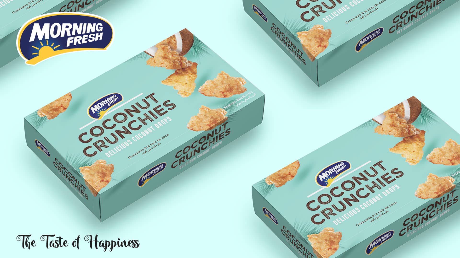
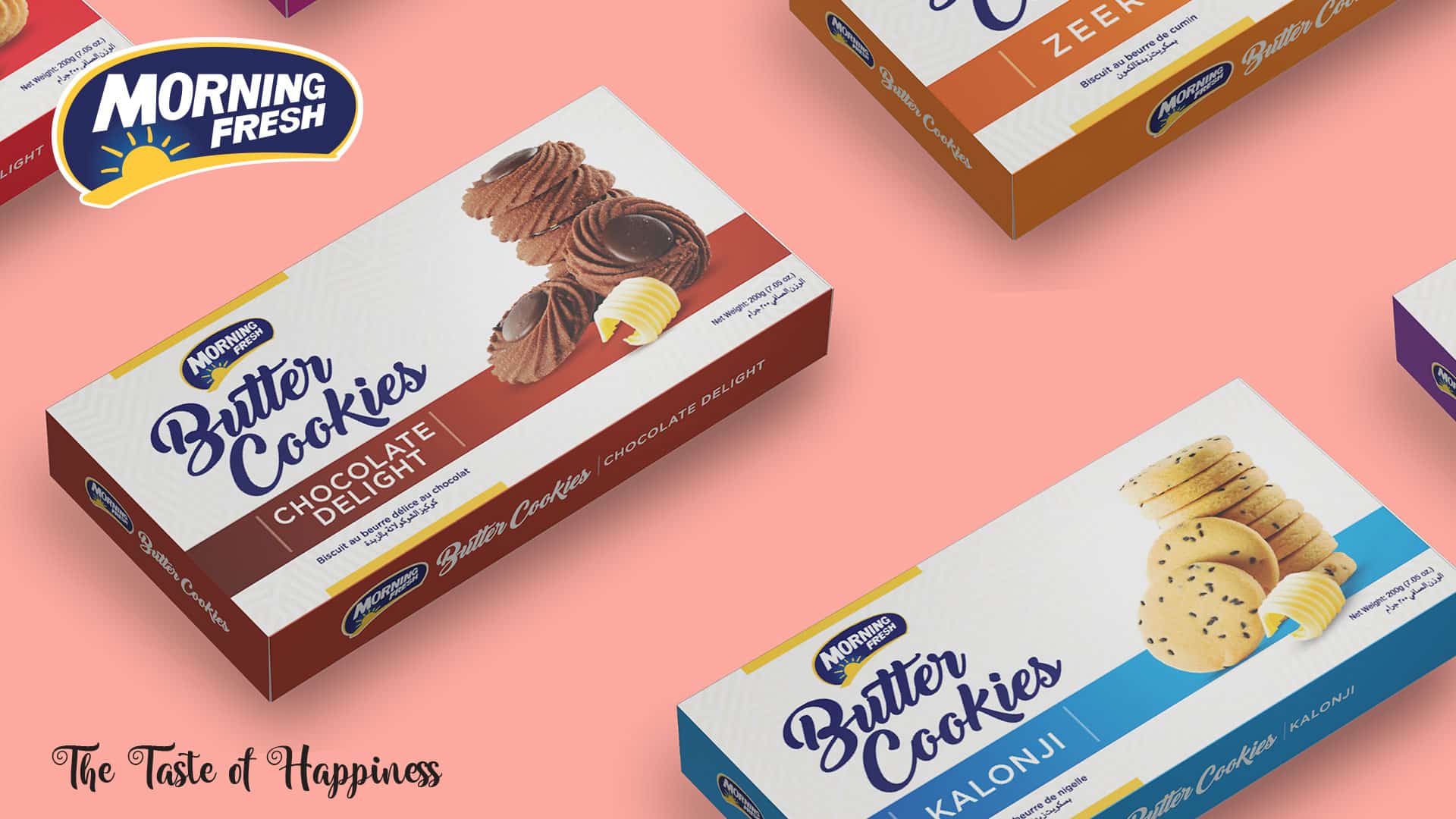
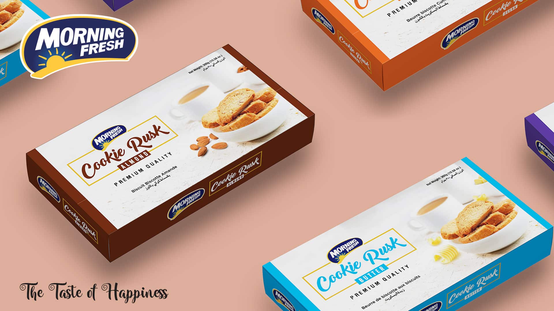
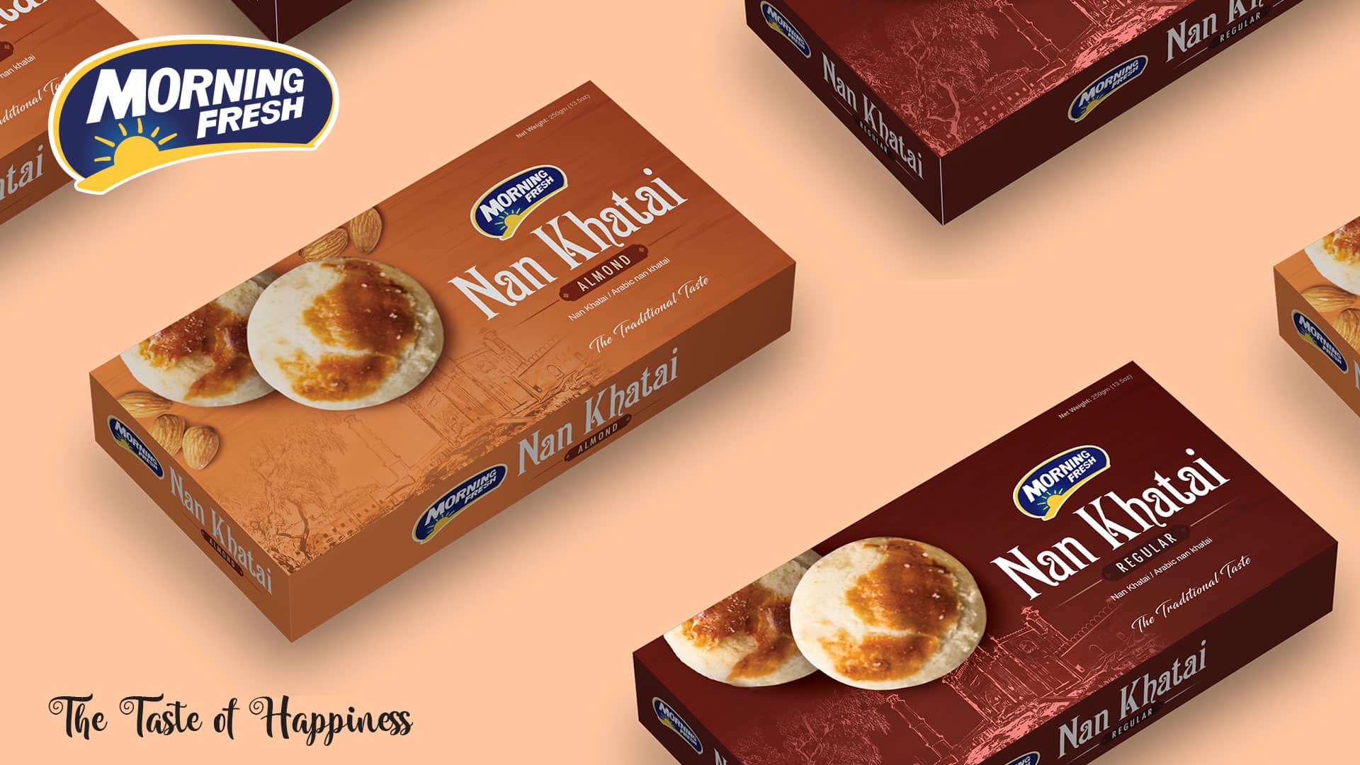
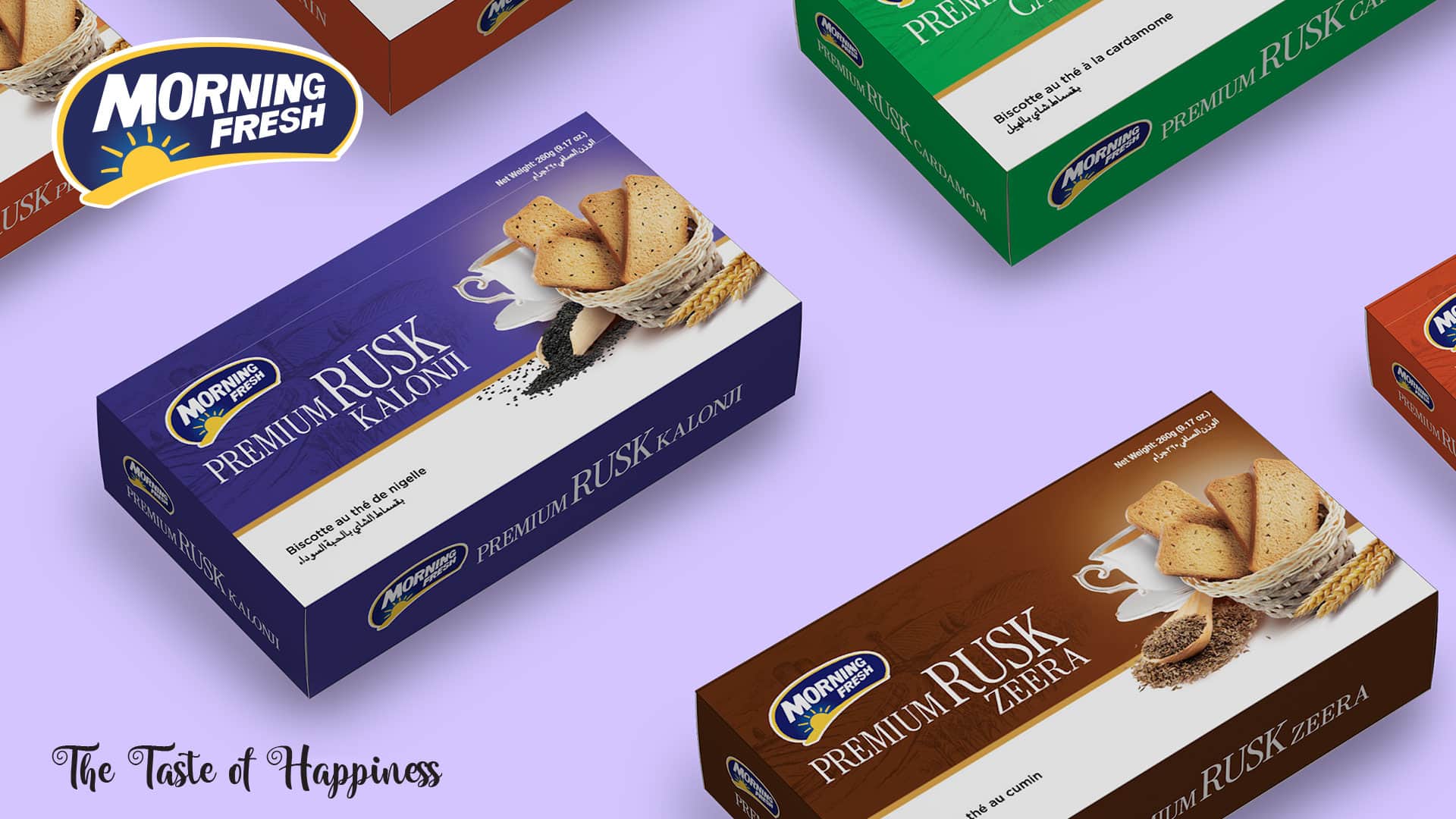
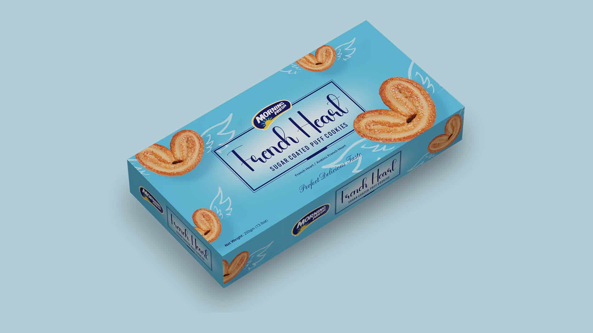
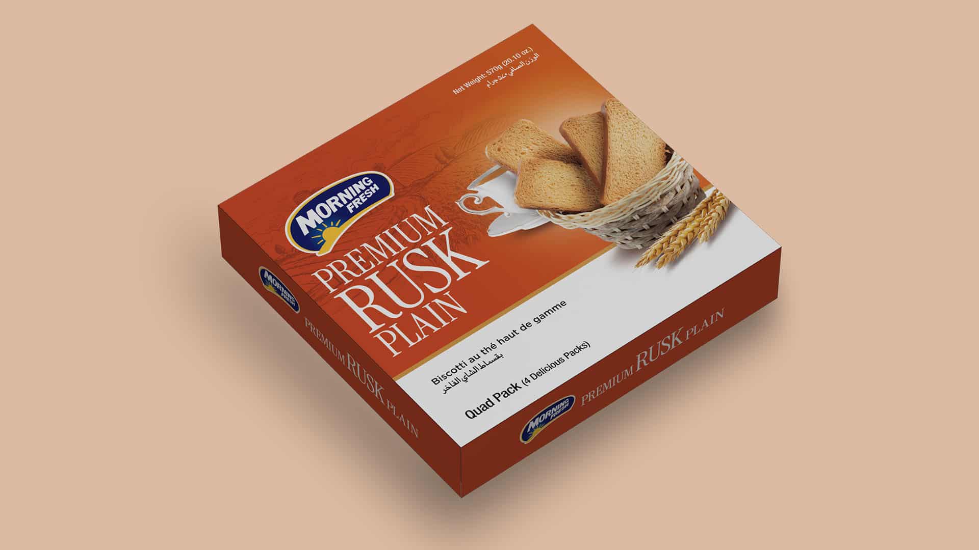
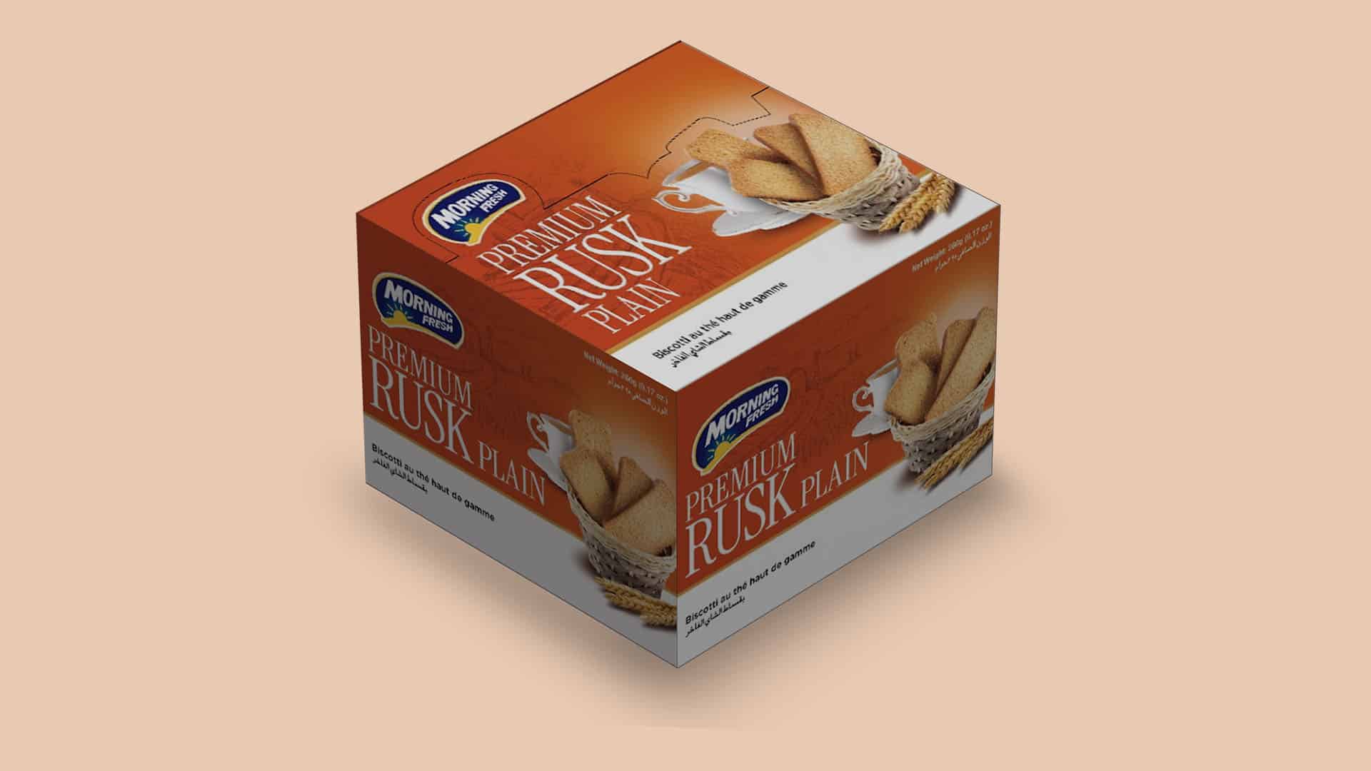
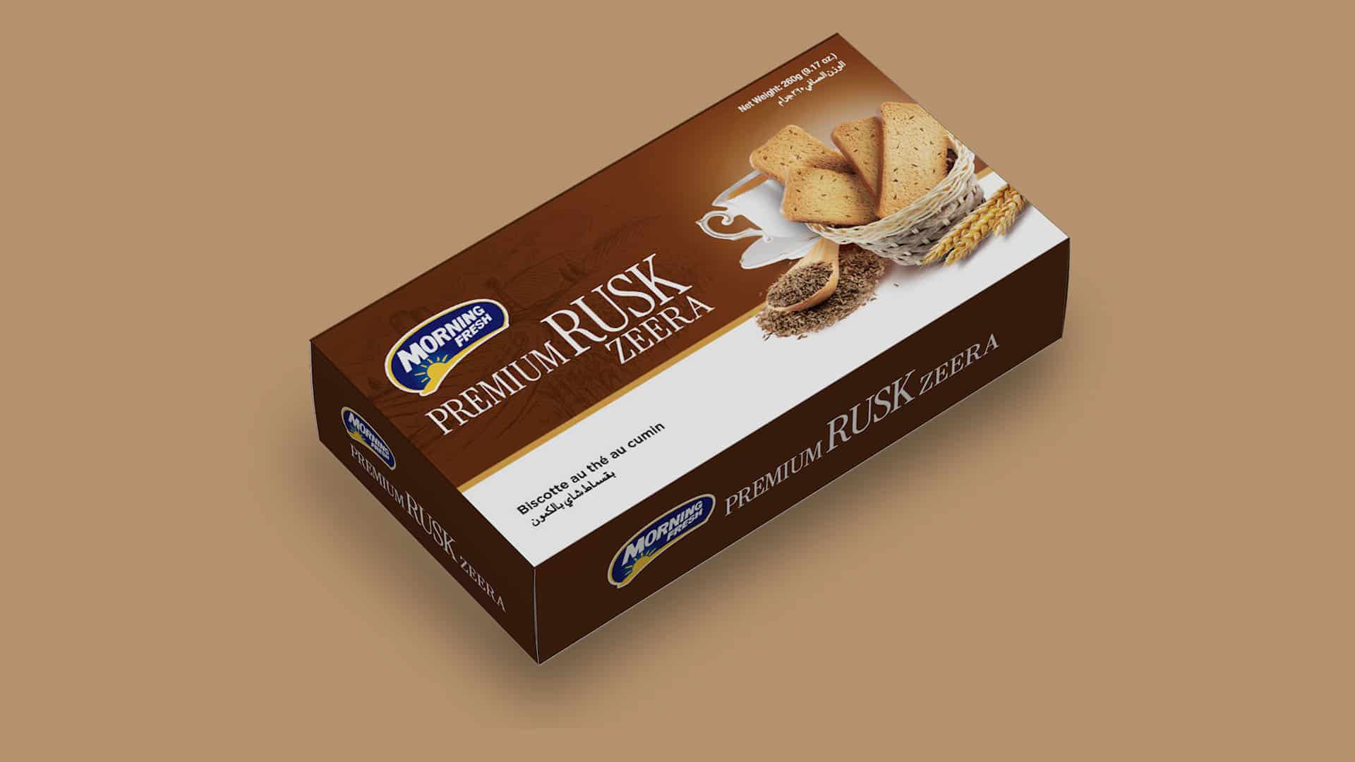
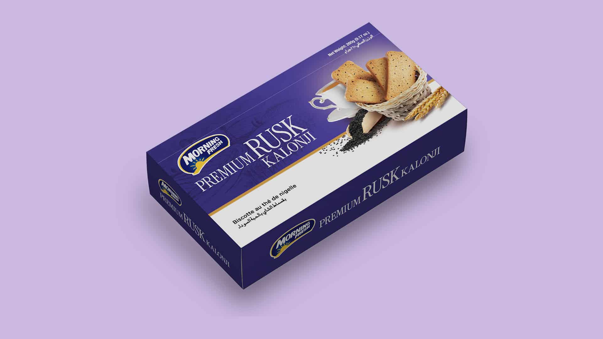
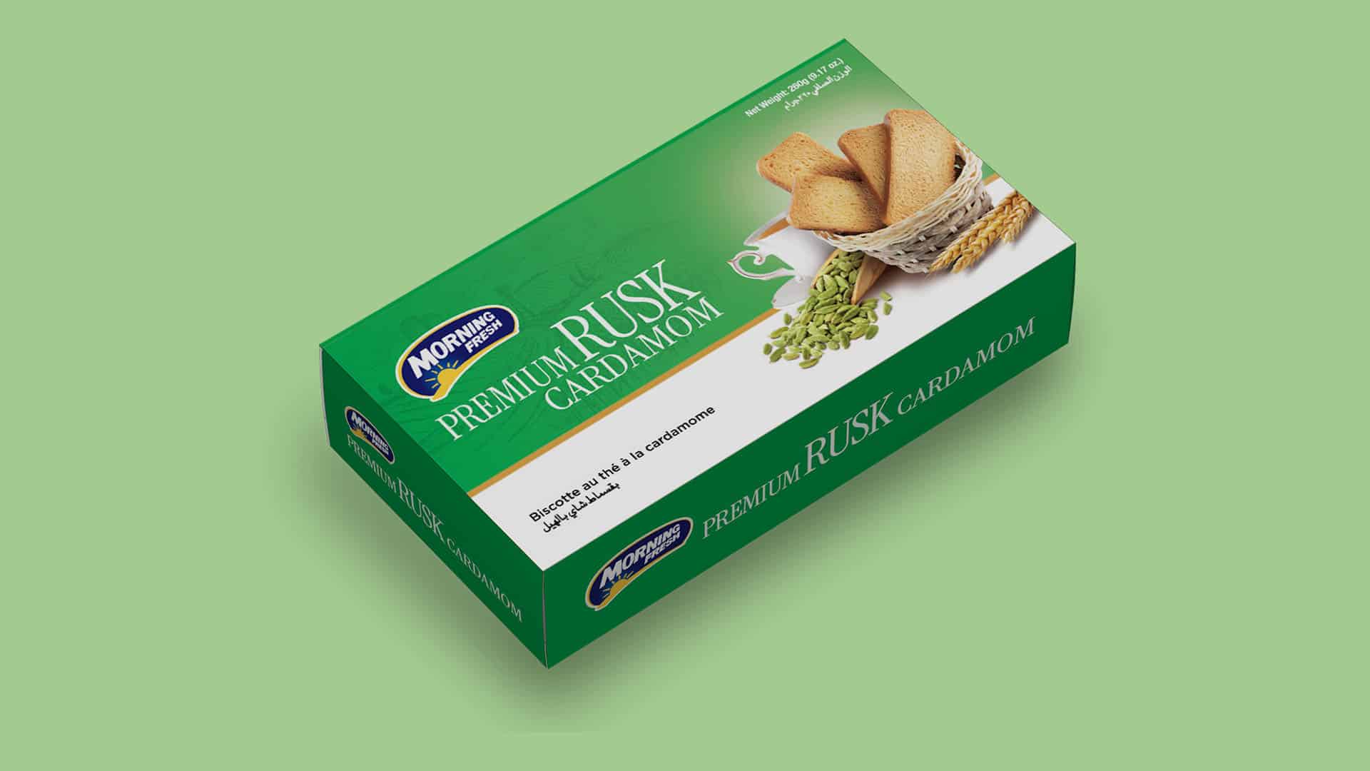
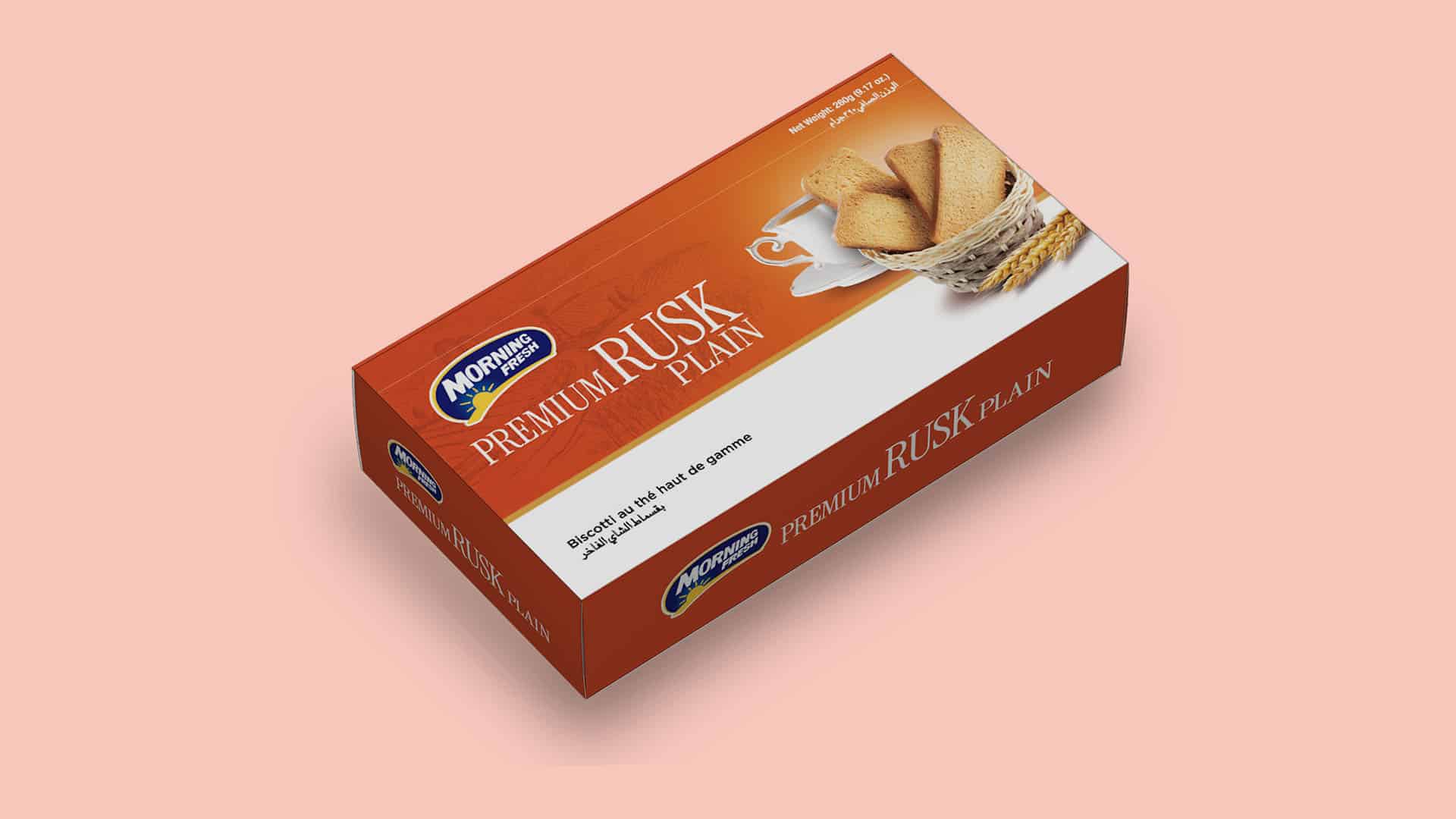
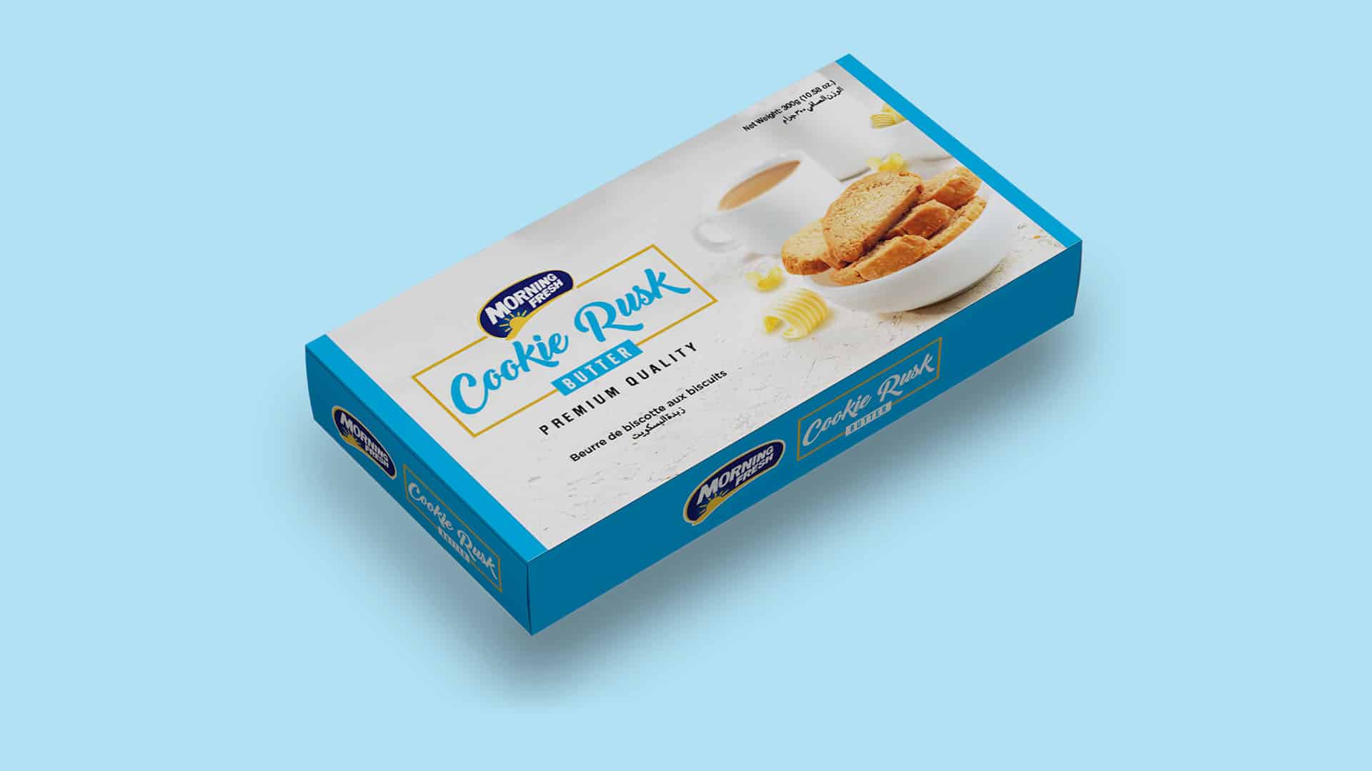
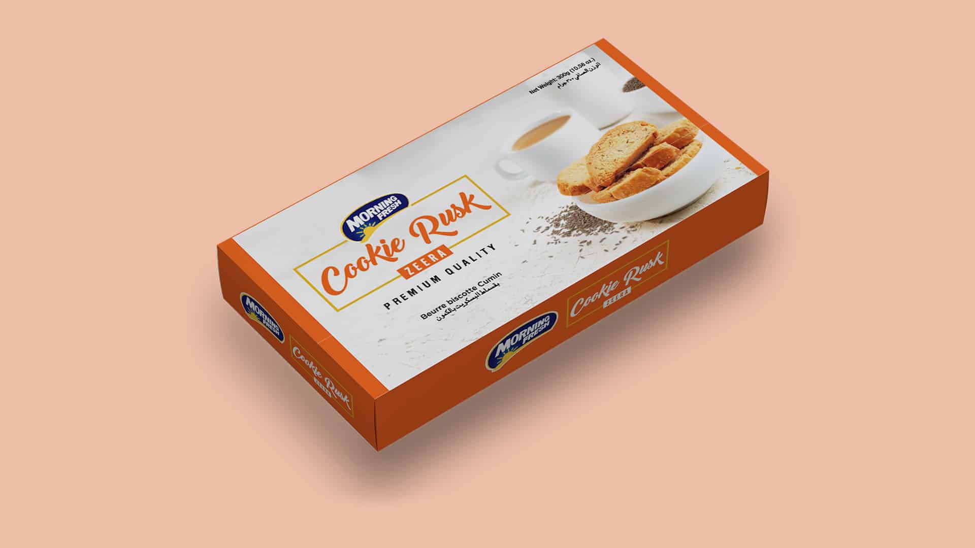
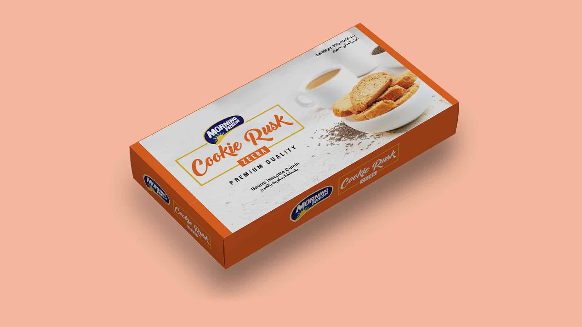
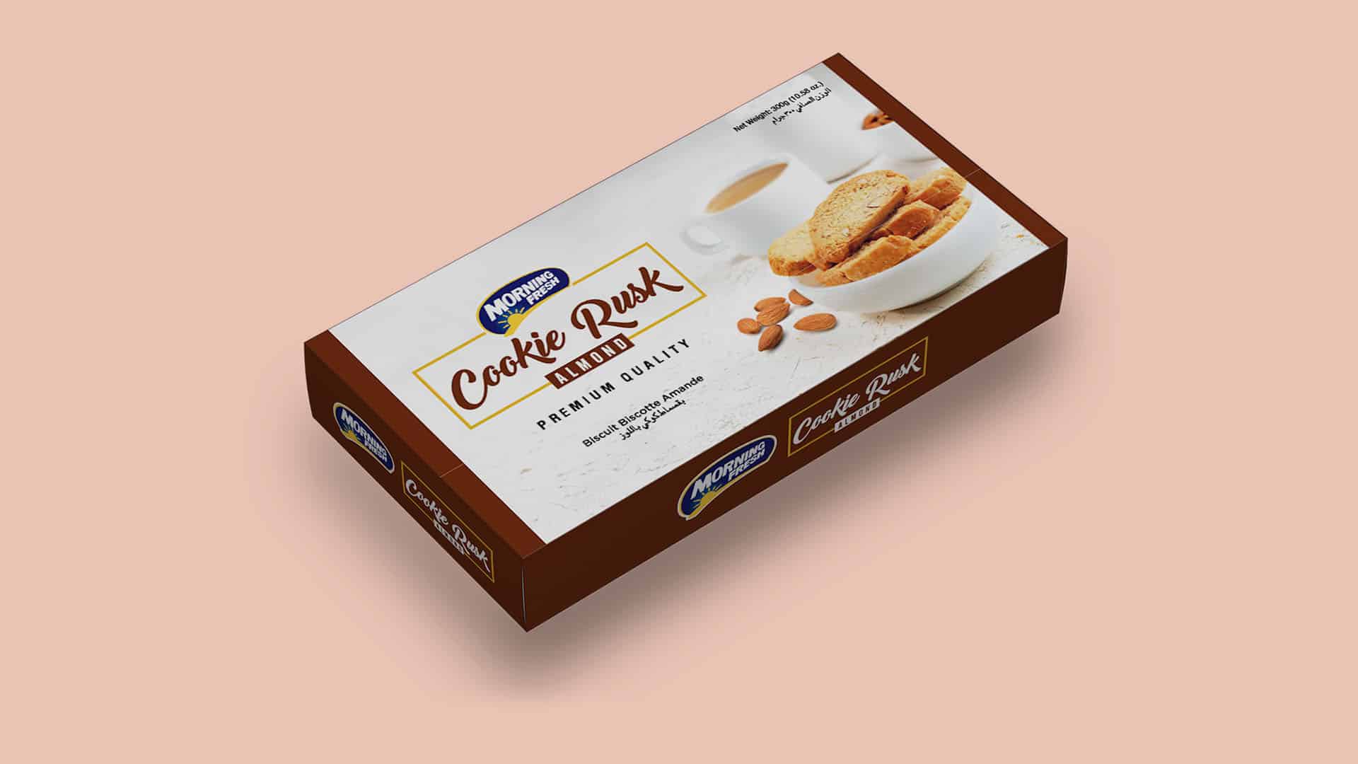
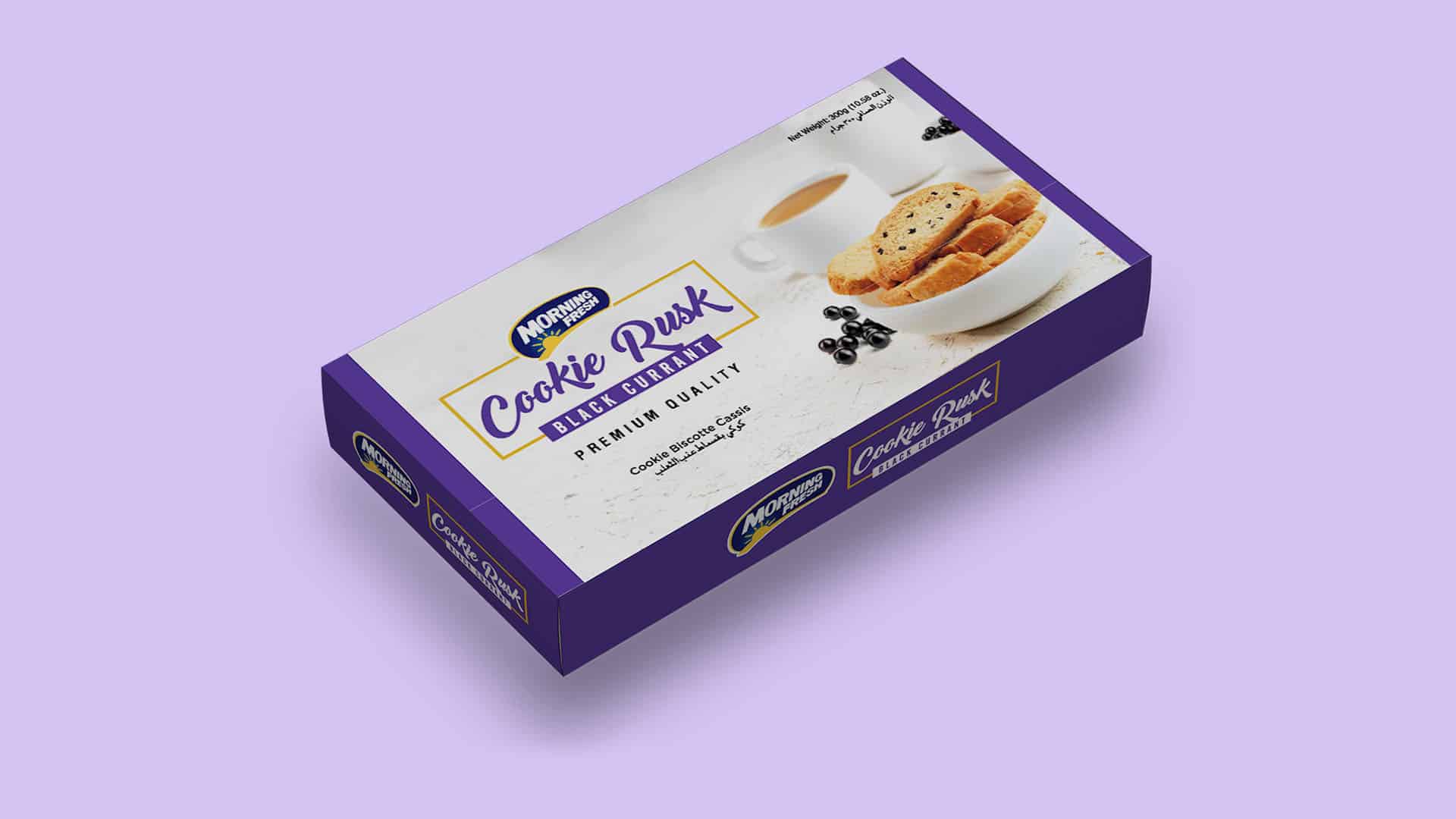
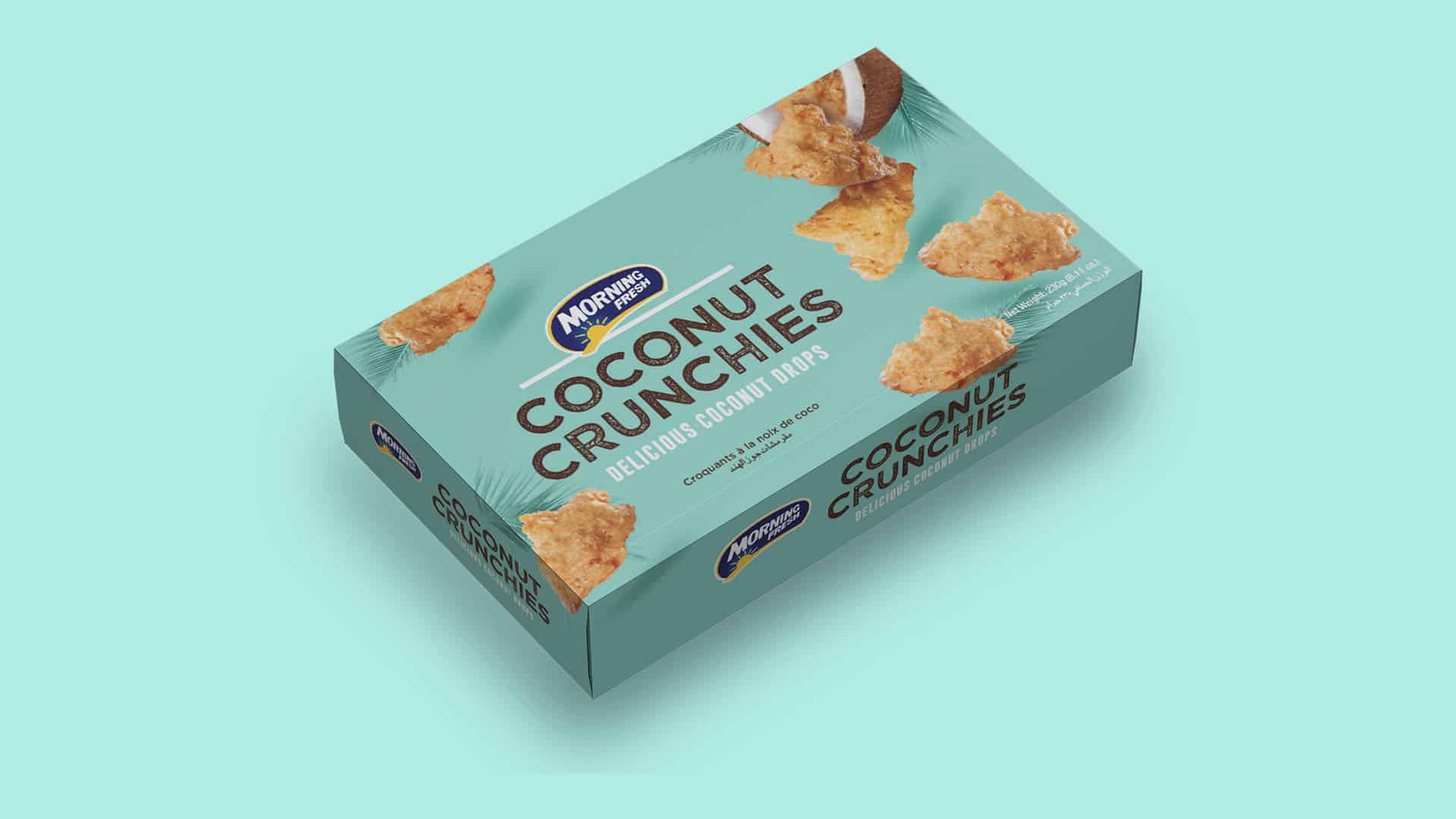
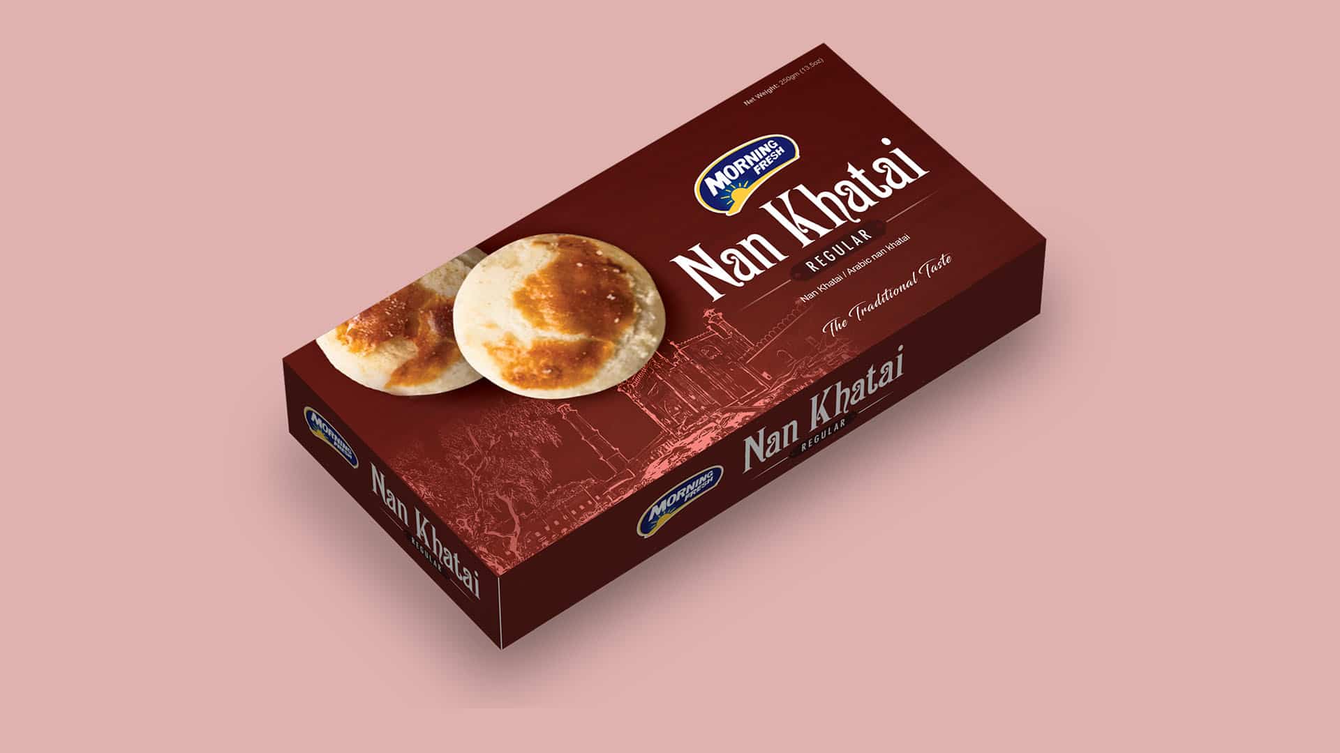
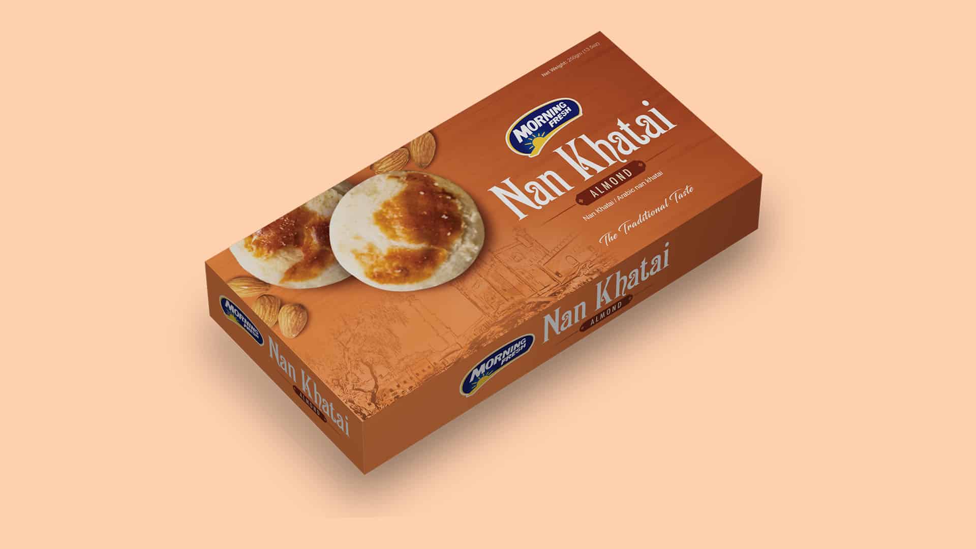
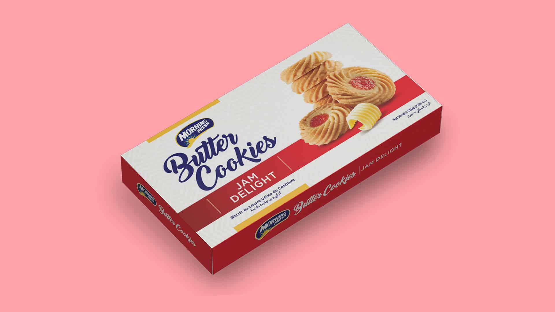
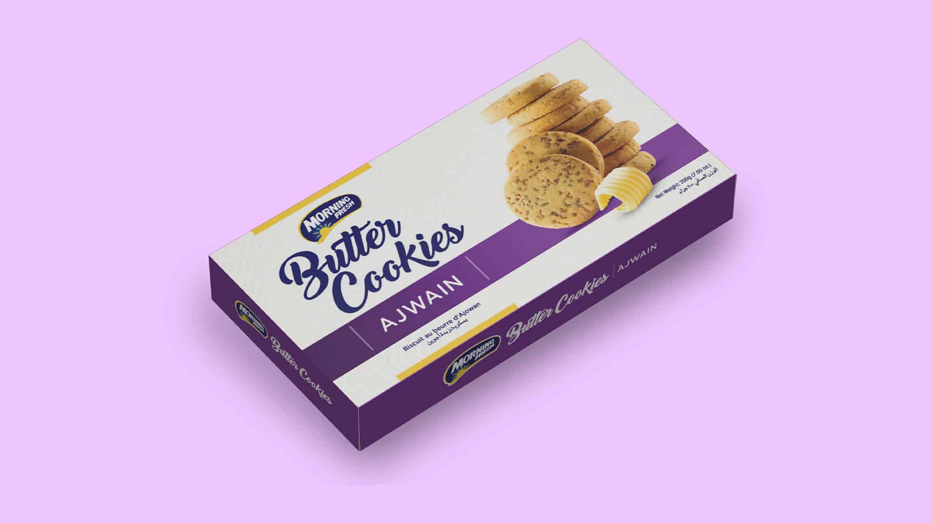
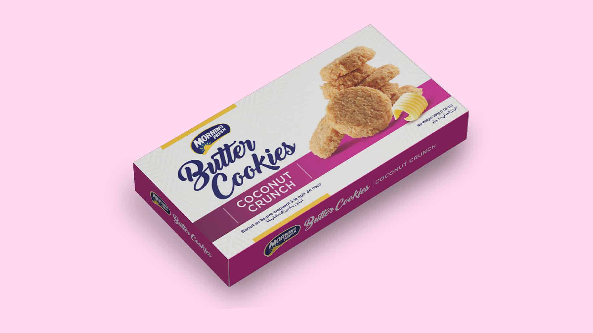
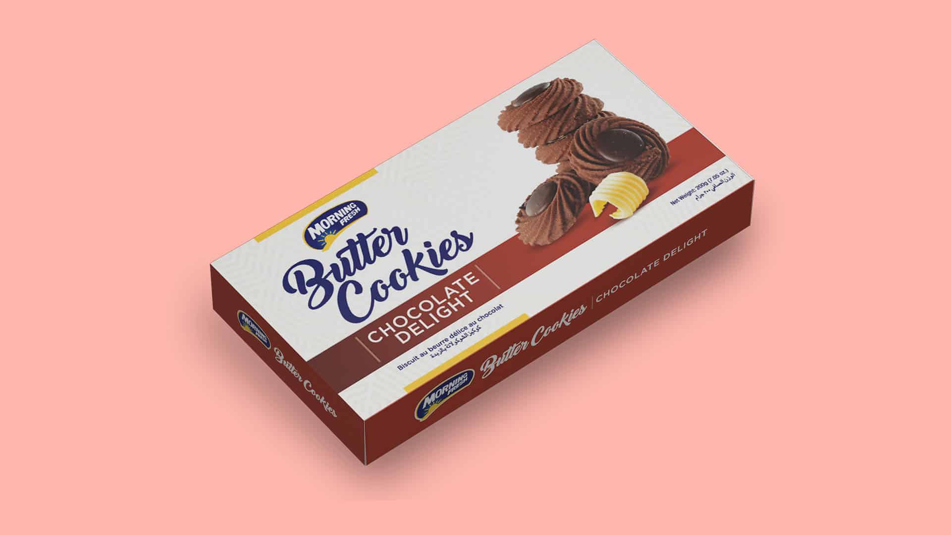
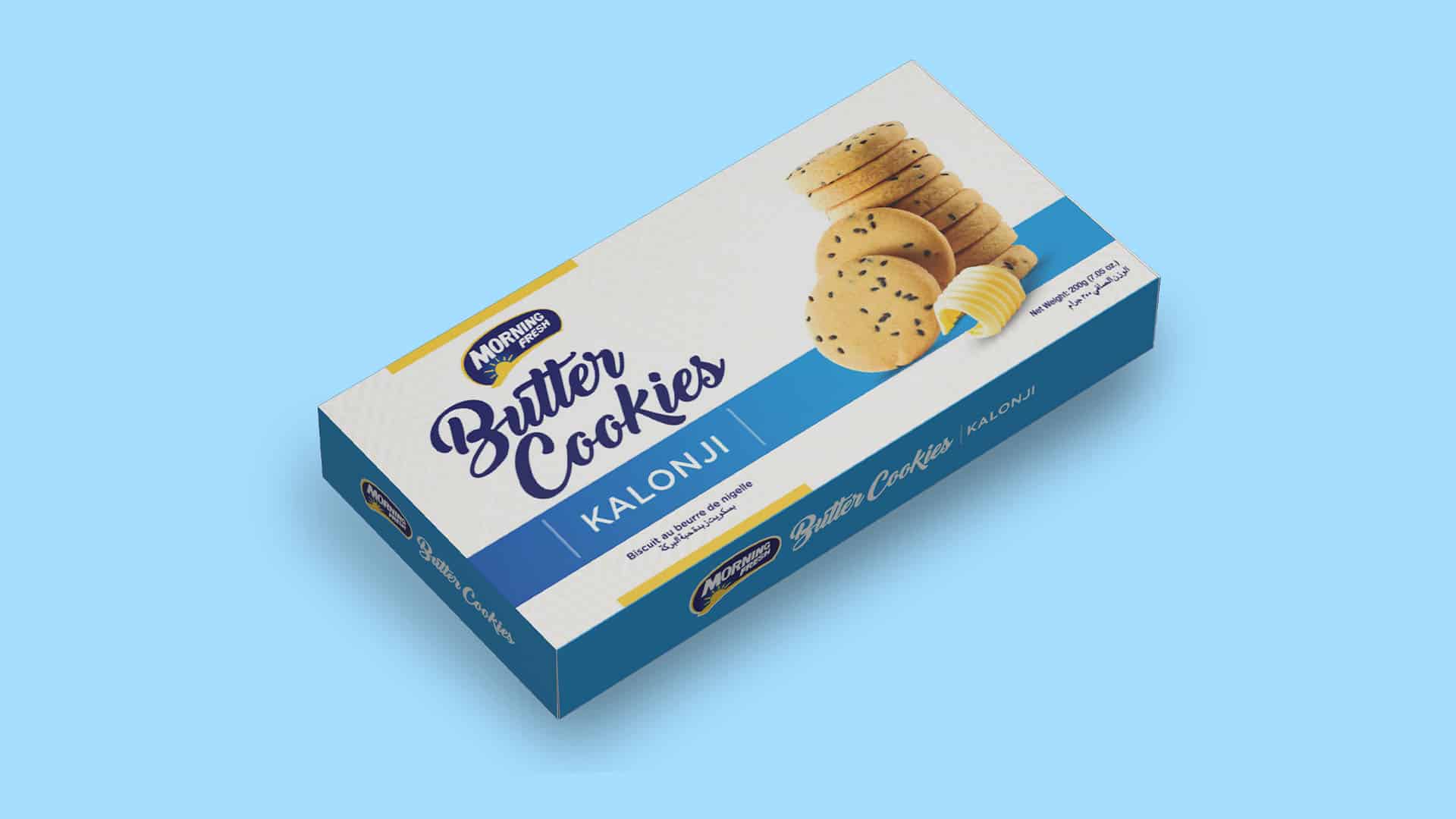
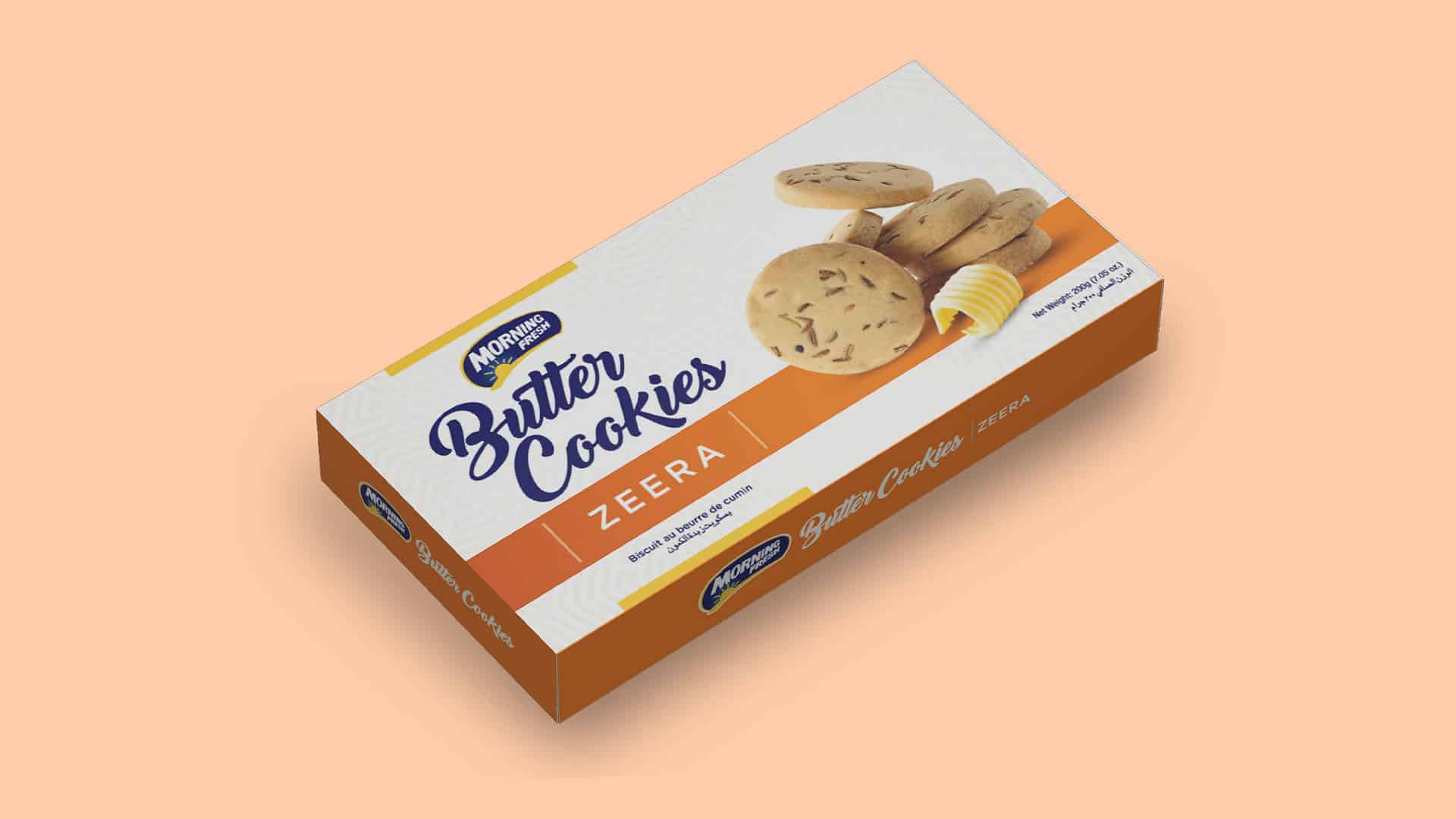
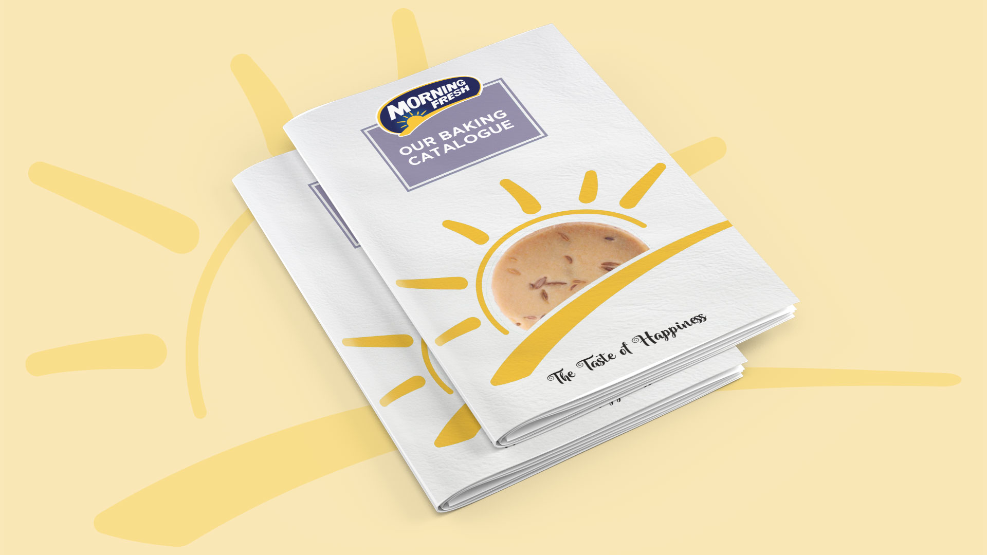
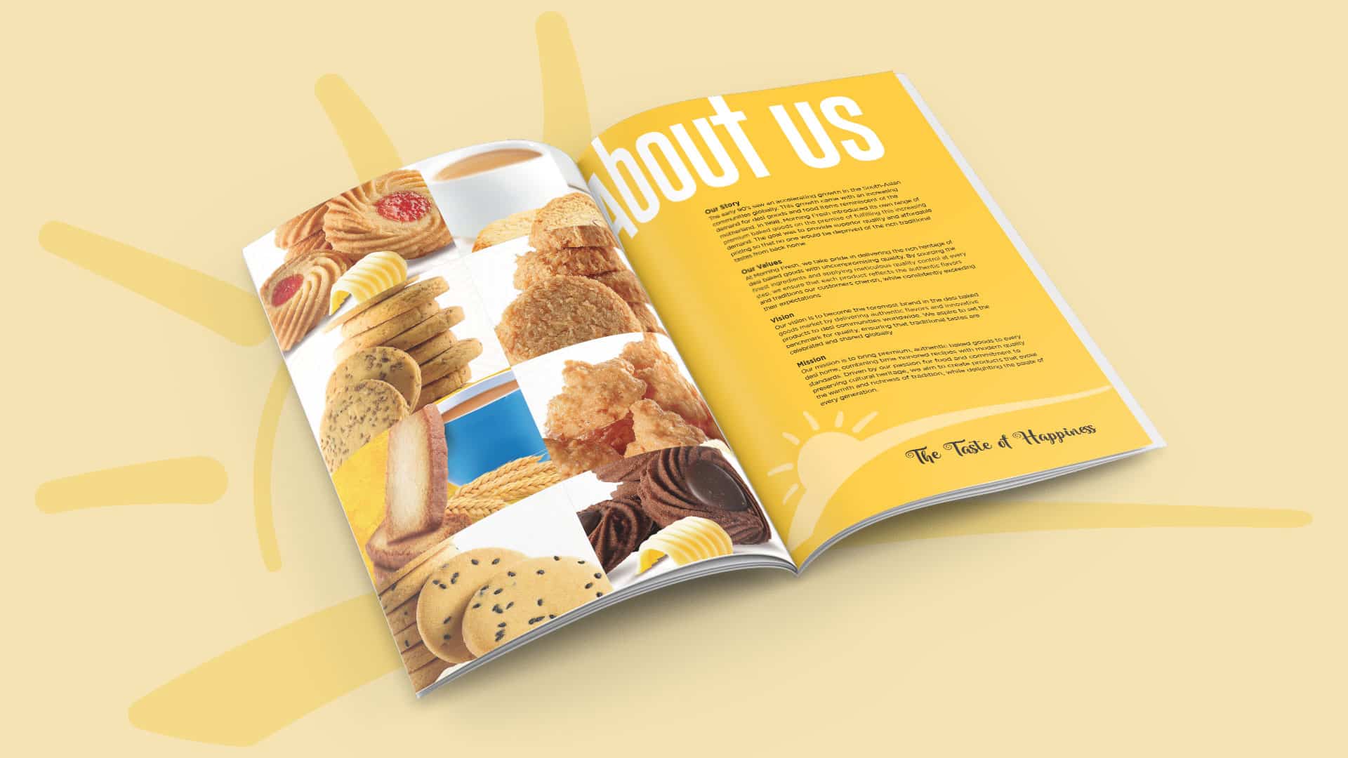
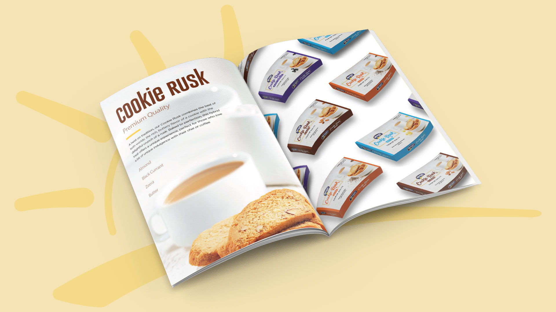
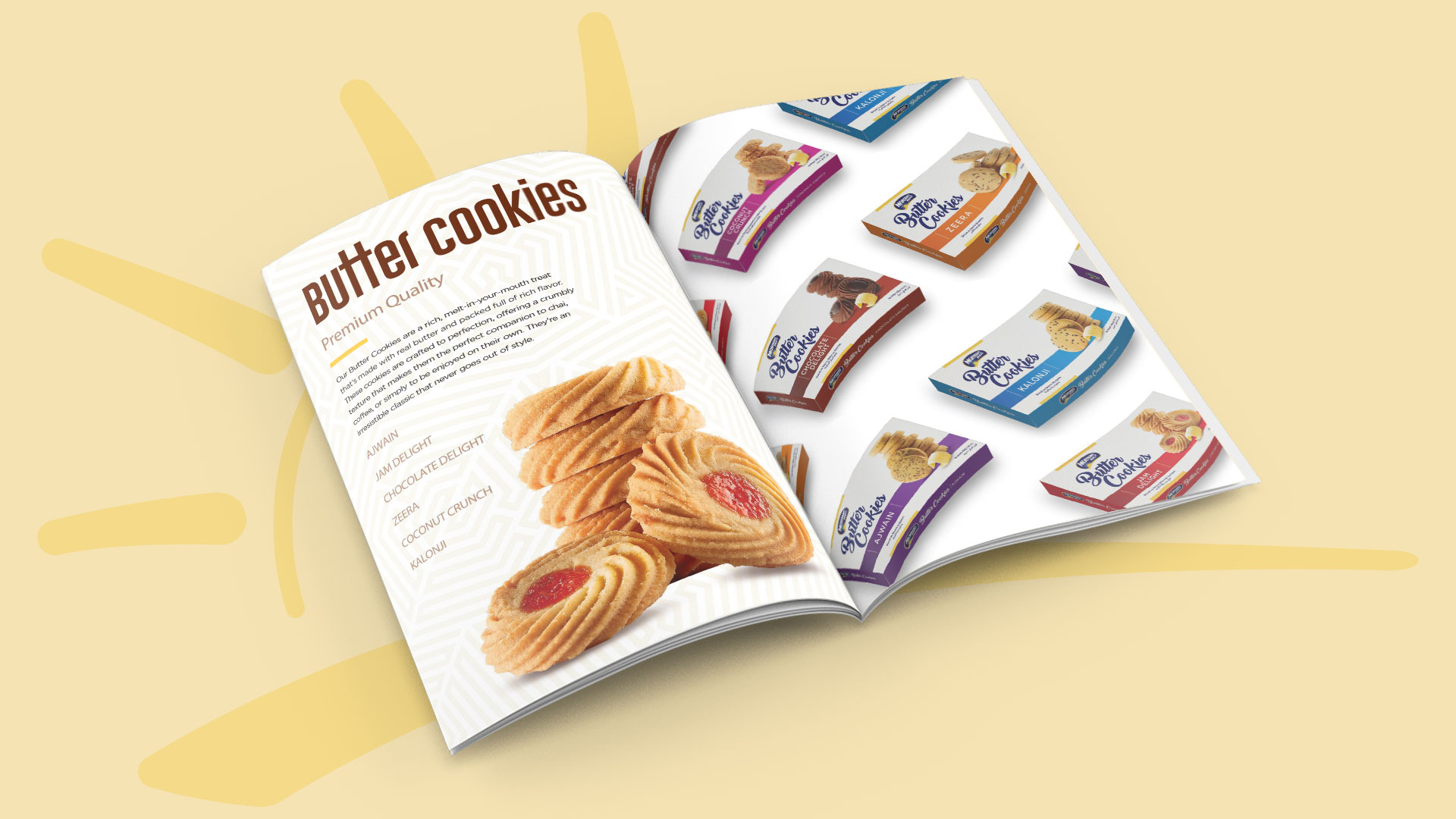
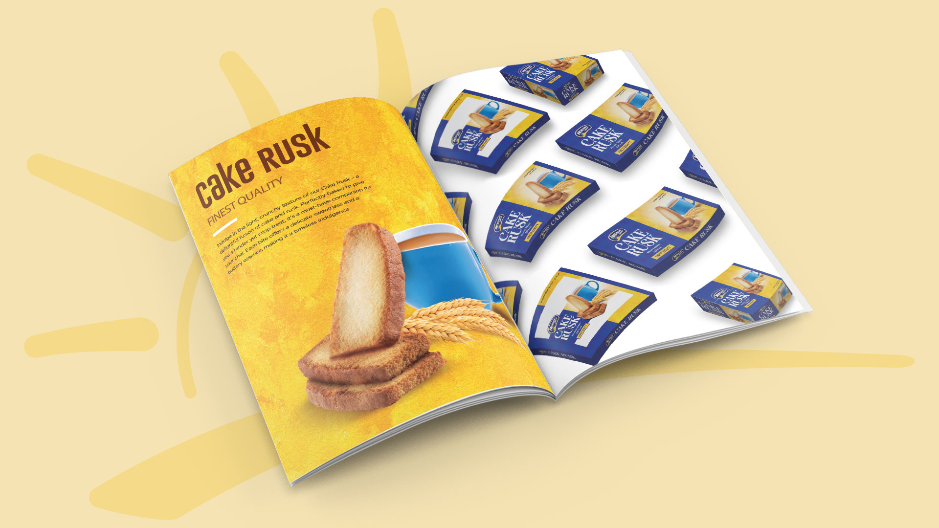
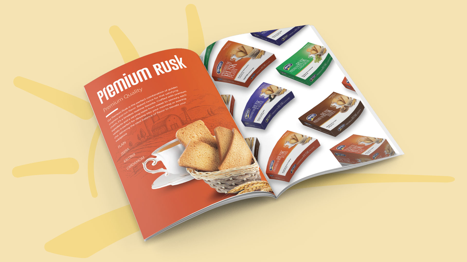
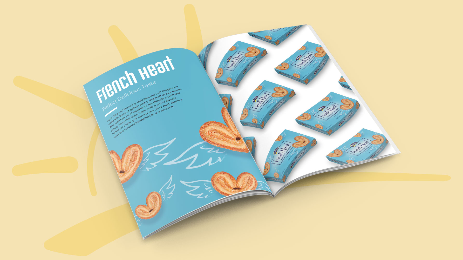
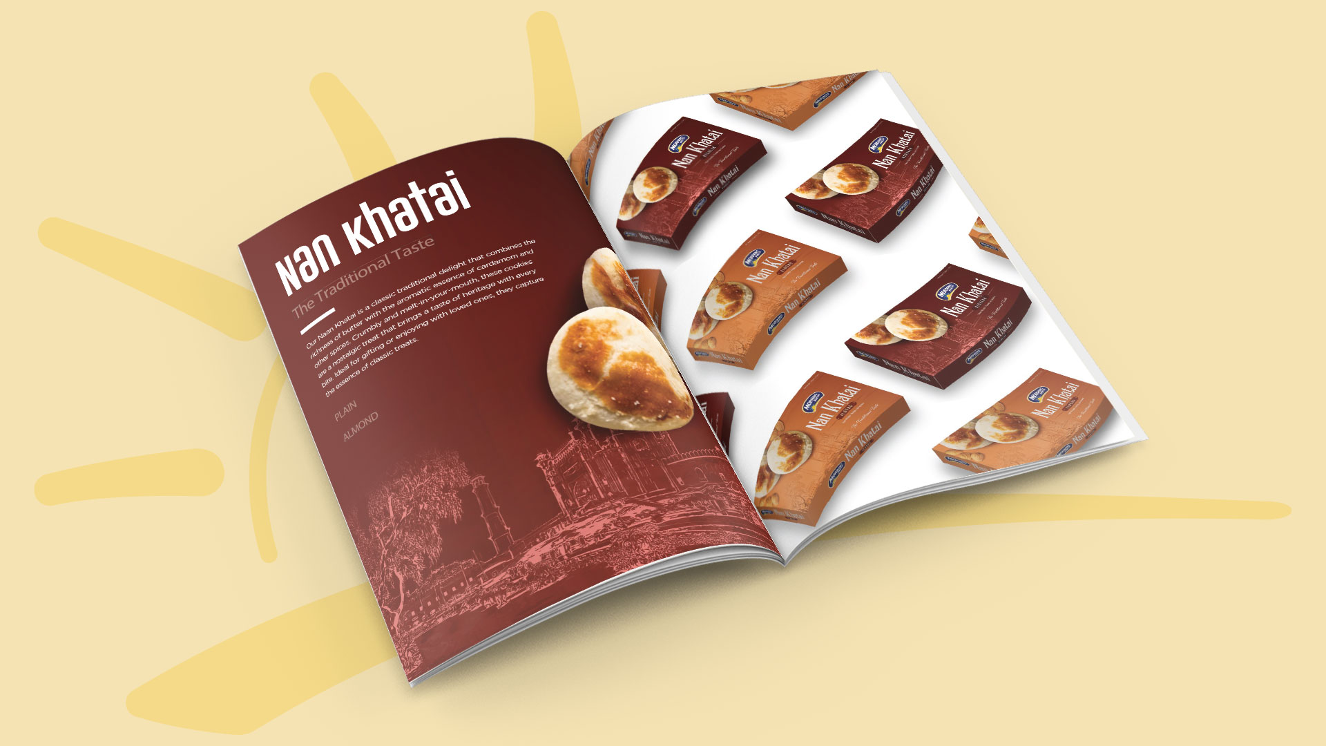
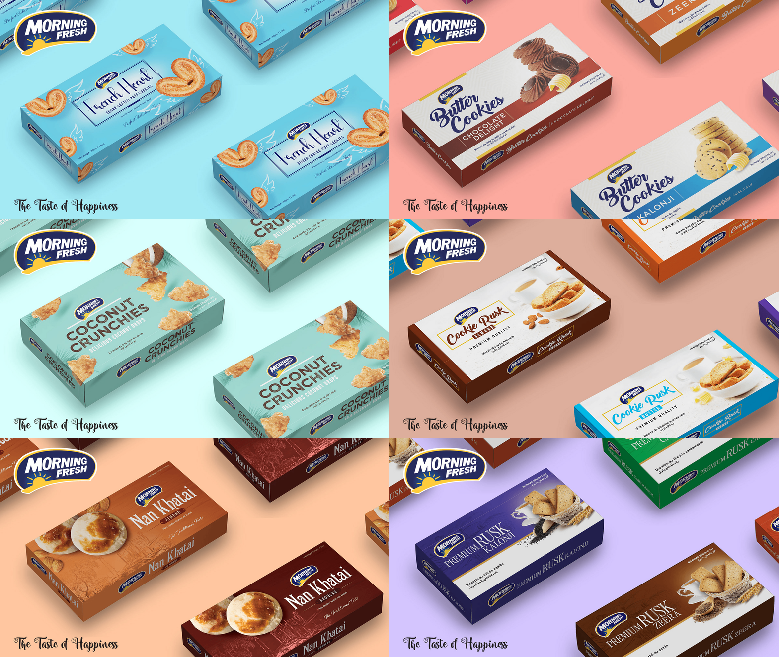
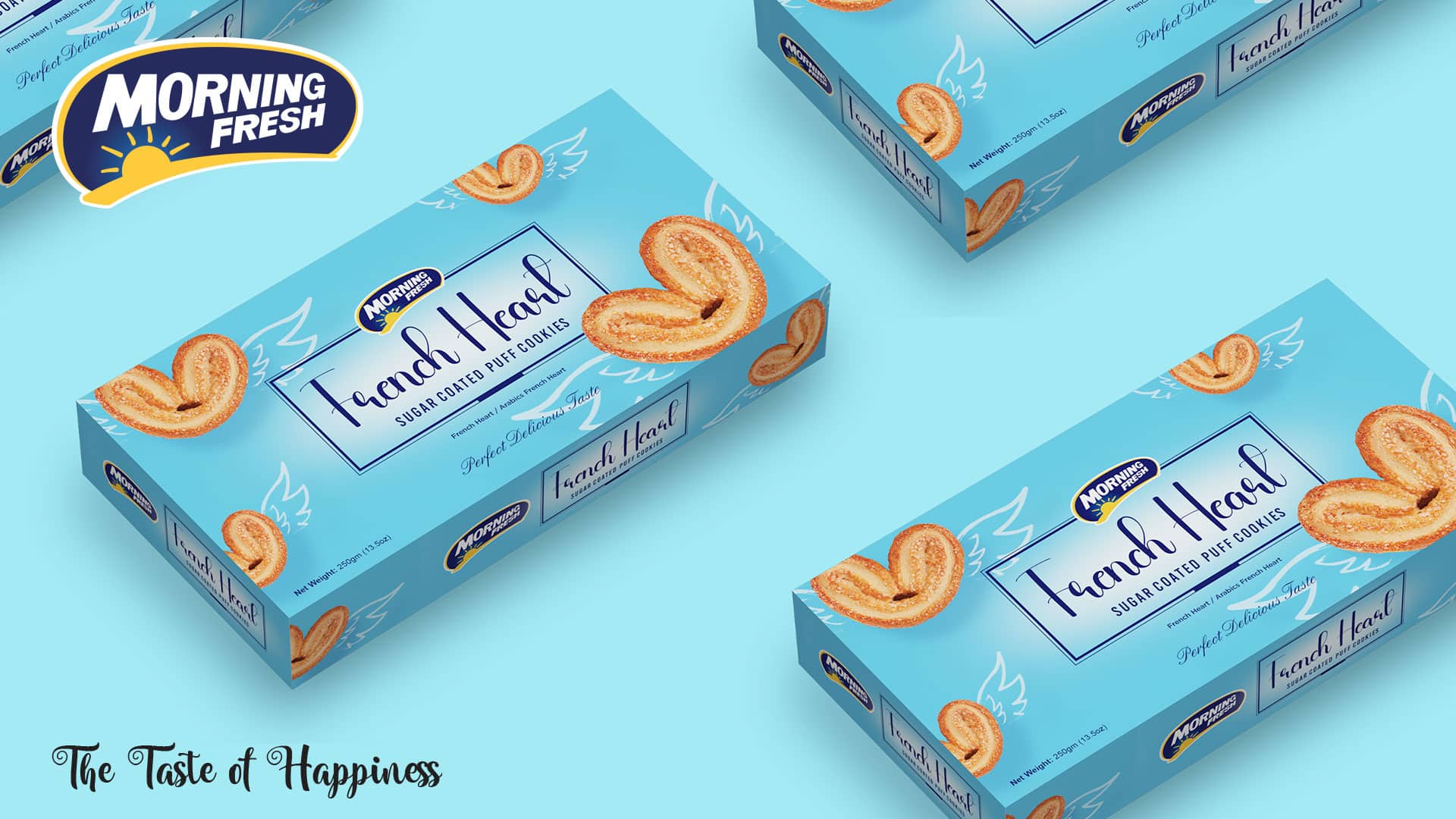
At Owl Studio, we spearheaded the branding and communication design for Morning Fresh’s baking range, tailored for the US market. Our approach seamlessly wove together the brand philosophy of welcoming each morning with nature’s best, encapsulating the brand’s ethos in both the packaging design and the portfolio brochure. By revolutionizing the branding odyssey with a soaring, neat, clean, and minimalist design approach, we ensured each element—from the packaging to the brochure—reflects Morning Fresh’s commitment to quality and tradition. Our designs are crafted to resonate with cultural heritage, emphasizing the full goodness and freshness of nature inherent in their products. This holistic approach not only highlights the brand’s dedication but also enhances consumer engagement, ensuring Morning Fresh stands out in the competitive market.
Packaging
Brand Philosophy
Morning Greets embodies the essence of starting each day with nature’s best. It stands as a testament to the commitment to health, happiness, and sustainability. The brand promises to deliver products that inspire wellness and vitality, creating a positive impact on both people and the planet.
Naming the Brand
“Morning Greets” was chosen to encapsulate the brand’s mission of greeting each morning with the finest offerings from nature. The name evokes feelings of freshness, nourishment, and a positive start to the day.
Brand Logo & Identity
Owl Studio’s design team meticulously crafted the Morning Greets brand logo to reflect the purity and natural essence of the products. The logo features a sun rising over a green field, symbolizing a fresh start and the nourishing power of nature.
- White & Blue Logo The logo, set in a white and blue finish, exudes freshness and natural goodness. It prominently features the rising sun, capturing the brand’s essence.
- Logo Layout The word “Morning” is placed at the top with a sunrise sketch, settled in a curve above the big curvy “Greets” lettering.
- Unique Font Styling The font used for “Morning Greets” is elegant yet approachable, designed to convey trust and warmth.
- Bold Curve Lettering for Logo Specially crafted bold curve lettering forming the logo insignia, with white fonts encapsulated by thick blue color outlining, representing the dawn of a new day.
- Rising Sun in Yellow Lines A rising sun depicted in yellow lines with blue color around, symbolizing an early morning feeling and a fresh start.
Brand Essence
“Nature’s Goodness, Every Day”
Brand Usage Guide
To ensure the Morning Greets brand identity remains consistent and impactful, Owl Studio developed a comprehensive Brand Usage Guide. This guide outlines precise specifications for logo placement, typography, color palettes, imagery, and other brand elements. It serves as a blueprint for all stakeholders, ensuring uniform communication of Morning Greets’ brand essence across all platforms.
Packaging Concept
Design Philosophy
Owl Studio’s design philosophy for Morning Greets’ packaging focuses on simplicity, natural elements, and clear communication of health benefits. Every design element is chosen to provide consumers with a visual and sensory experience that mirrors the natural goodness within.
Brand Imagery
Morning Greets’ brand imagery is a visual celebration of natural ingredients and wholesome mornings. Each visual captures the brand’s commitment to quality and sustainability, from sunlit fields to fresh, healthy breakfasts. The imagery is designed to evoke feelings of warmth, health, and a connection to nature. The visual elements align with the vision of nurturing the world with nature’s best and providing “Nature’s Goodness, Every Day,” reflecting the mission to inspire wellness, happiness, and the zeal to thrive in life.
Visual Storytelling Design Elements
- Wheat Field and Light Blue Sky: Depicting a serene morning scene with a vast wheat field and a light blue sky to convey freshness and natural origin.
- Bowl at the Bottom with Berries and Milk Splash: Featuring a bowl of berries, milk splash, and cereal biscuits at the bottom to highlight the product.
- Yellow Curve Top Border Panel: A distinctive yellow curve top border panel, slit by a green outline, emphasizing the natural and healthy aspect.
- Wheat Motif Background: Incorporating a subtle wheat motif in the background to reinforce the connection to wholesome, natural ingredients.
Read More
Read Less
Key Visuals
