Where Science Meets
Timeless Beauty
Project Scope
- Brand Portfolio & Architecture
- Brand Identity & Imagery
- Brand Style Guidelines
- Logo Creation
- Packaging & Label
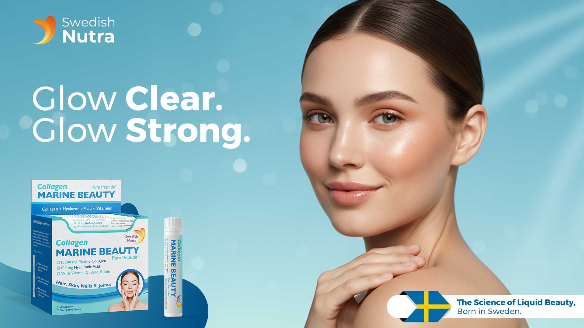
Swedish Nutra brings together advanced European science and nature-powered ingredients to redefine modern beauty from within. Designed for women who demand visible results without compromise, Swedish Nutra transforms daily self-care into a luxurious beauty ritual.
Rooted in Swedish innovation, our formulations blend cutting-edge skincare science with clinically proven actives, delivering nourishment at a cellular level. From age-defying renewal to effortless glow, every product is crafted to support skin that looks smoother, firmer and visibly radiant — at every stage of life.
Swedish Nutra is more than beauty. It’s confidence, clarity and care — bottled with precision.
Brand Philosophy
Morning Greets embodies the essence of starting each day with nature’s best. It stands as a testament to the commitment to health, happiness and sustainability. The brand promises to deliver products that inspire wellness and vitality, creating a positive impact on both people and the planet.
Naming the Brand
“Morning Greets” was chosen to encapsulate the brand’s mission of greeting each morning with the finest offerings from nature. The name evokes feelings of freshness, nourishment and a positive start to the day.
Brand Logo & Identity
Owl Studio’s design team meticulously crafted the Morning Greets brand logo to reflect the purity and natural essence of the products. The logo features a sun rising over a green field, symbolizing a fresh start and the nourishing power of nature.
- White & Blue Logo The logo, set in a white and blue finish, exudes freshness and natural goodness. It prominently features the rising sun, capturing the brand’s essence.
- Logo Layout The word “Morning” is placed at the top with a sunrise sketch, settled in a curve above the big curvy “Greets” lettering.
- Unique Font Styling The font used for “Morning Greets” is elegant yet approachable, designed to convey trust and warmth.
- Bold Curve Lettering for Logo Specially crafted bold curve lettering forming the logo insignia, with white fonts encapsulated by thick blue color outlining, representing the dawn of a new day.
- Rising Sun in Yellow Lines A rising sun depicted in yellow lines with blue color around, symbolizing an early morning feeling and a fresh start.
Brand Essence
“Nature’s Goodness, Every Day”
Brand Usage Guide
To ensure the Morning Greets brand identity remains consistent and impactful, Owl Studio developed a comprehensive Brand Usage Guide. This guide outlines precise specifications for logo placement, typography, color palettes, imagery and other brand elements. It serves as a blueprint for all stakeholders, ensuring uniform communication of Morning Greets’ brand essence across all platforms.
Packaging Concept
Design Philosophy
Owl Studio’s design philosophy for Morning Greets’ packaging focuses on simplicity, natural elements and clear communication of health benefits. Every design element is chosen to provide consumers with a visual and sensory experience that mirrors the natural goodness within.
Brand Imagery
Morning Greets’ brand imagery is a visual celebration of natural ingredients and wholesome mornings. Each visual captures the brand’s commitment to quality and sustainability, from sunlit fields to fresh, healthy breakfasts. The imagery is designed to evoke feelings of warmth, health and a connection to nature. The visual elements align with the vision of nurturing the world with nature’s best and providing “Nature’s Goodness, Every Day,” reflecting the mission to inspire wellness, happiness and the zeal to thrive in life.
Visual Storytelling Design Elements
- Wheat Field and Light Blue Sky: Depicting a serene morning scene with a vast wheat field and a light blue sky to convey freshness and natural origin.
- Bowl at the Bottom with Berries and Milk Splash: Featuring a bowl of berries, milk splash and cereal biscuits at the bottom to highlight the product.
- Yellow Curve Top Border Panel: A distinctive yellow curve top border panel, slit by a green outline, emphasizing the natural and healthy aspect.
- Wheat Motif Background: Incorporating a subtle wheat motif in the background to reinforce the connection to wholesome, natural ingredients.
Read More
Read Less
Marine Beauty Shots


Key Visuals


Gold Retinol Shots


Key Visuals


