Nature's Symphony: Crafting Creamy & Fruity Greek Yogurt
Project Scope
- Brand Purpose
- Brand Strategy & Positioning
- Brand Portfolio & Architecture
- Brand Identity & Imagery
- Brand Style Guidelines
- Logo Creation
- Packaging & Label
- Messaging & Tone-of-Voice
- Brand Concepts & Communications
- Brand Tagline
- Experiential Designs
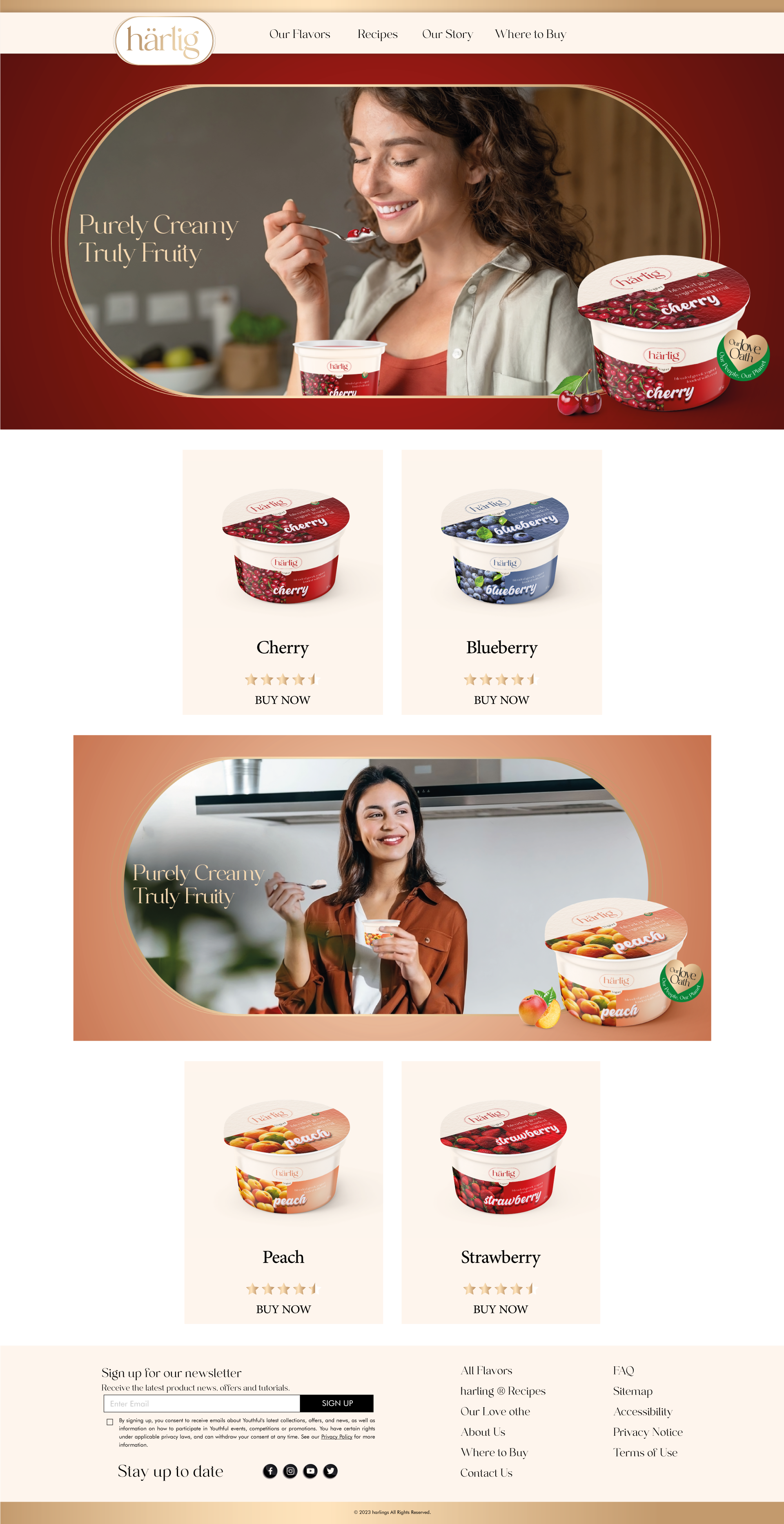
- Website & E-commerce
- Retail Branding & Merchandise
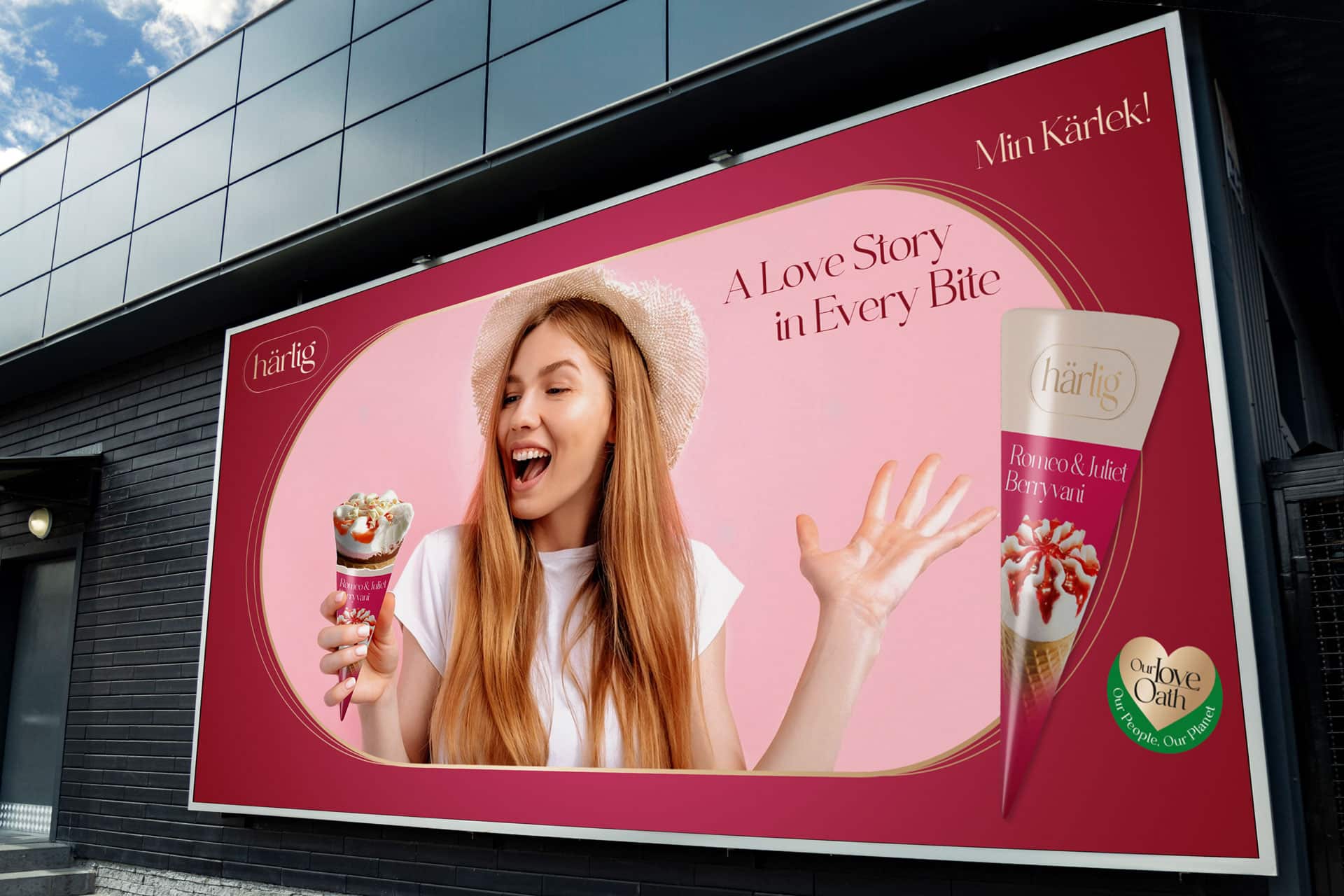
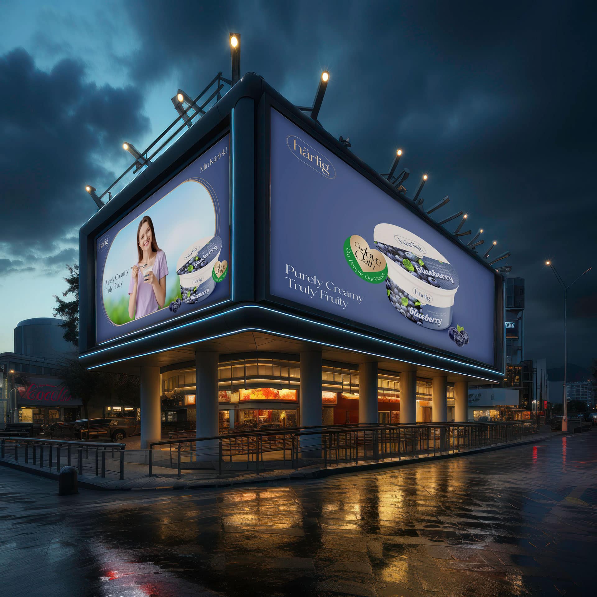
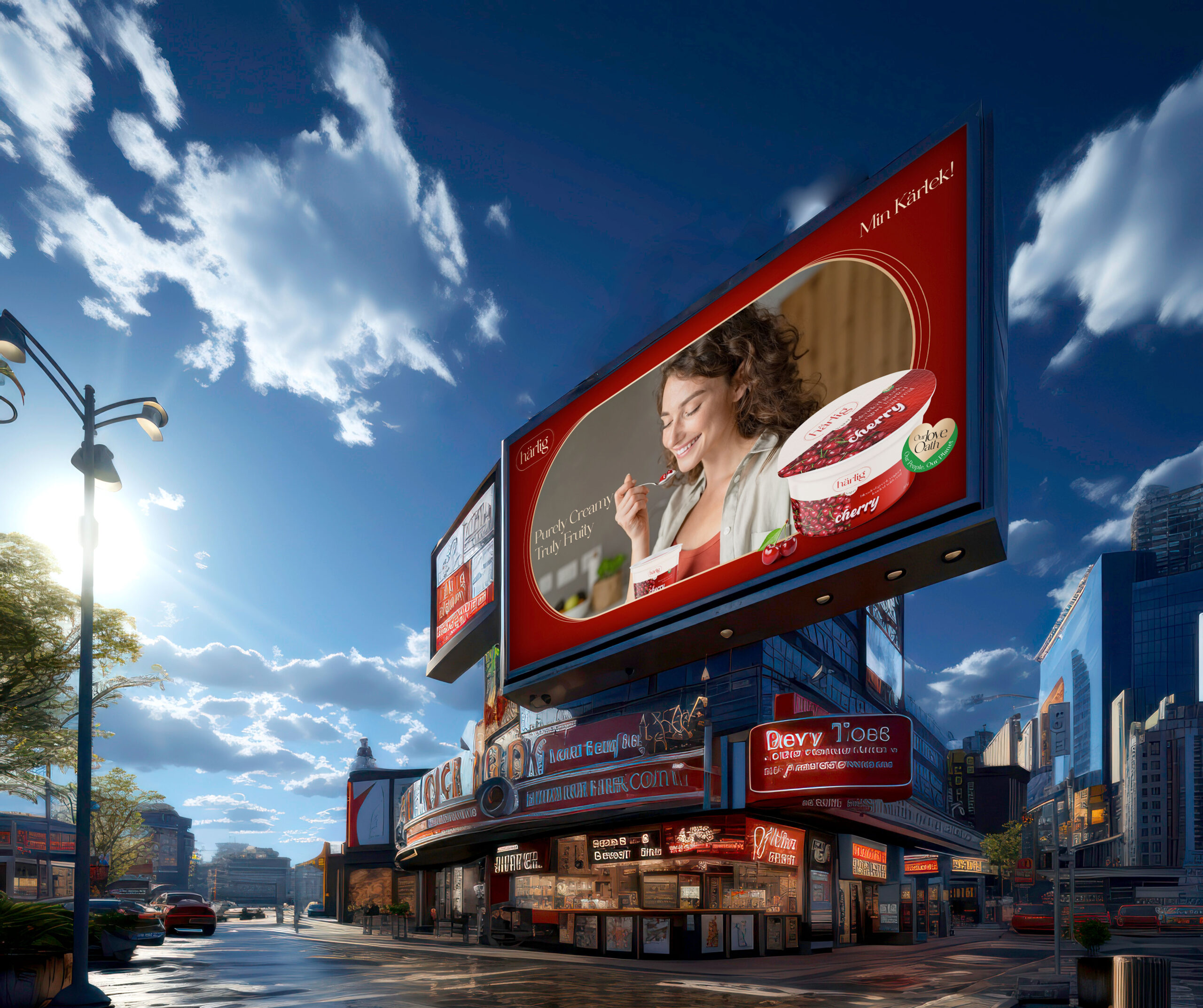
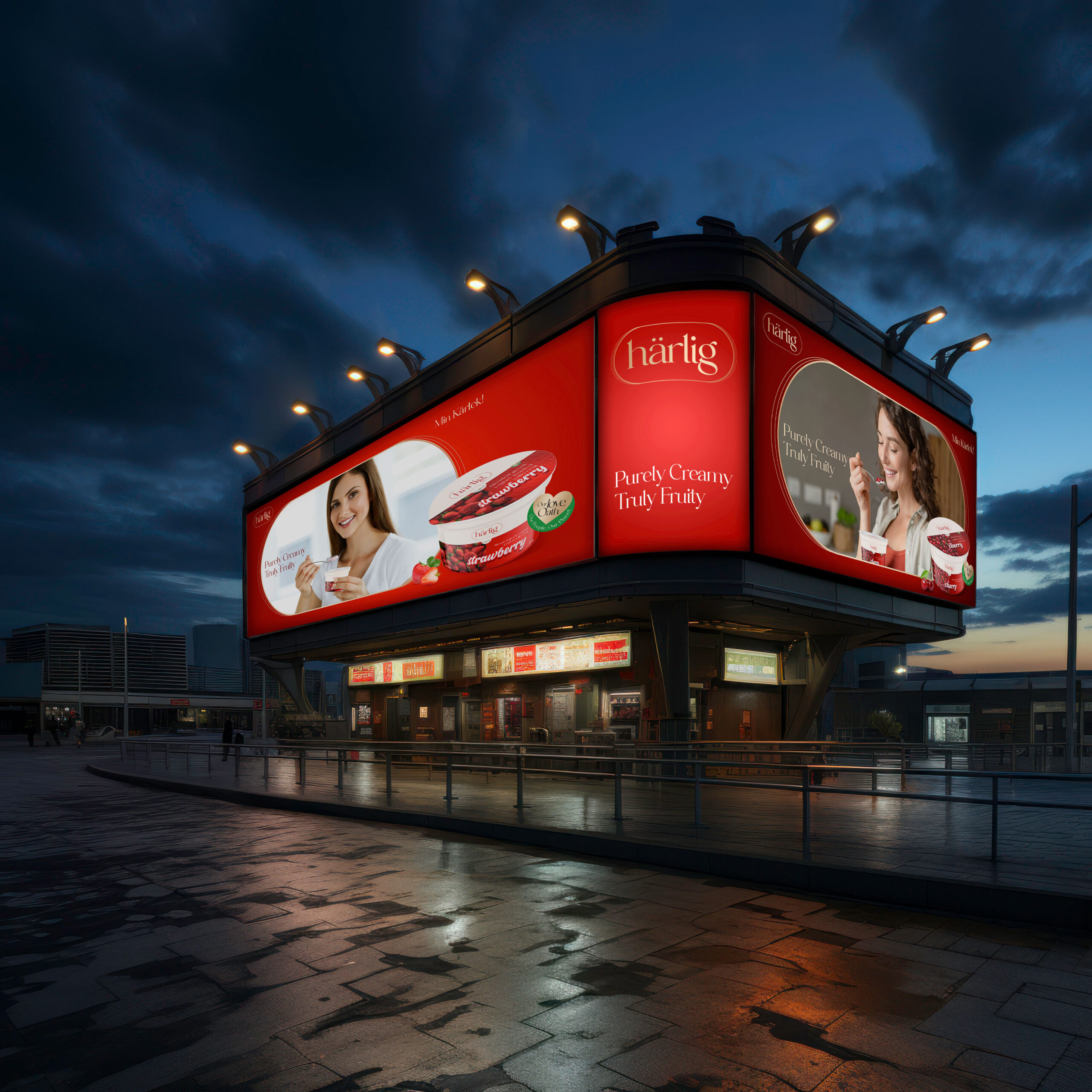
- OOH - Signage & Billboard
- Marketing Collateral
OWL Studio developed the brand film and communication for Harlig Greek Yogurt, built around a sensorial idea of everyday indulgence rooted in natural goodness.
The Idea
A Moment Just for Me
Creative Direction
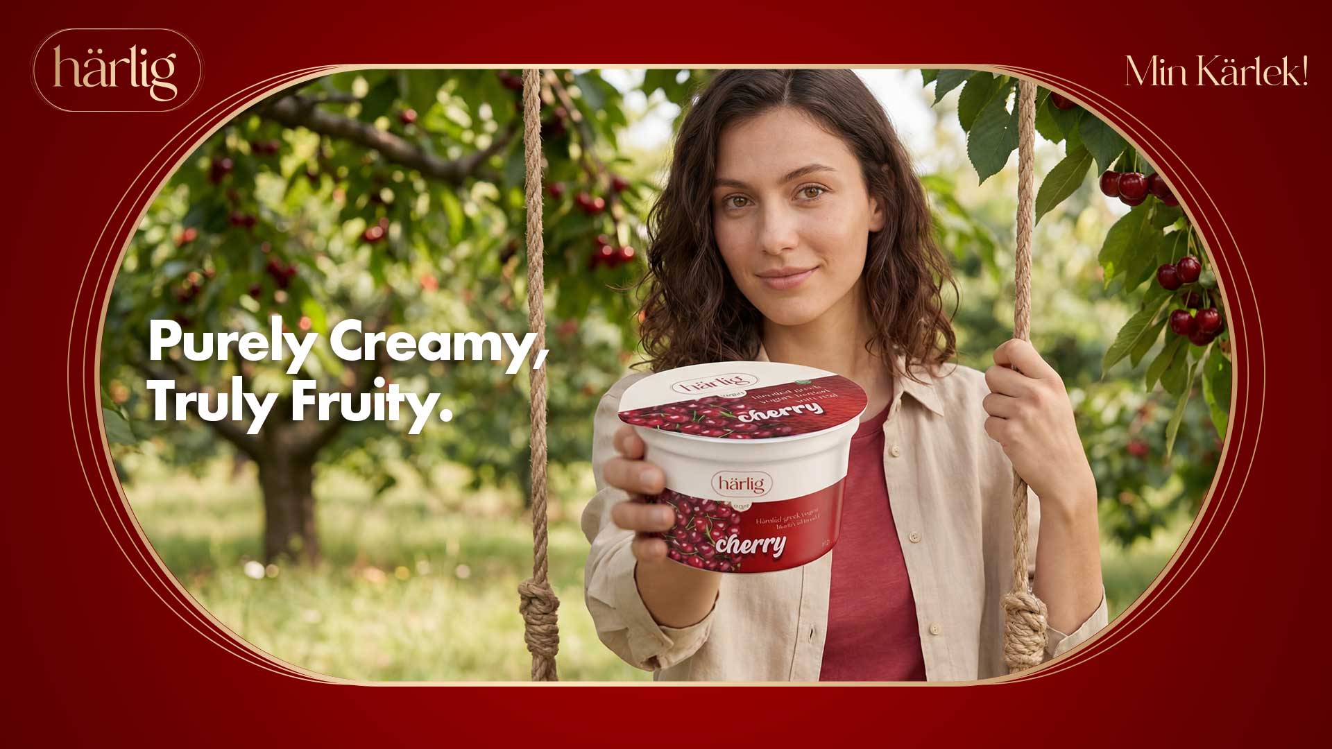
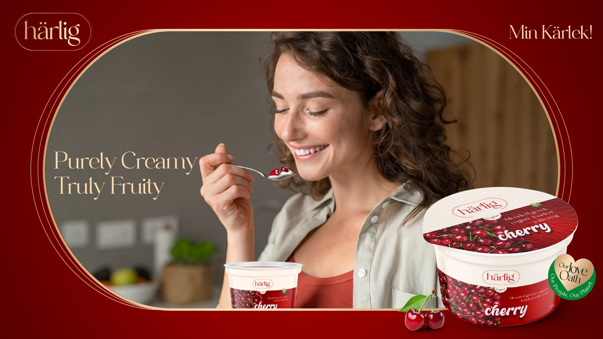
Creamy textures, real fruit chunks and natural light are highlighted to enhance both appetite appeal and authenticity, where each spoonful feels rich, fresh and genuinely satisfying.
Visual World
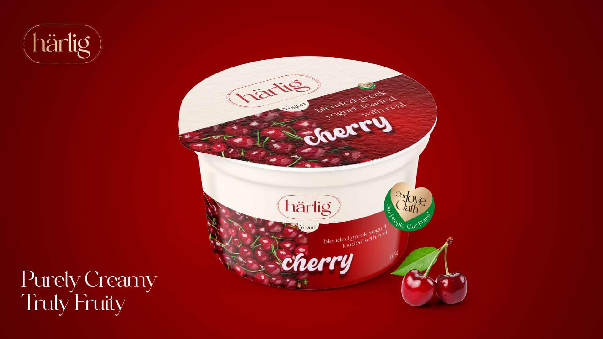
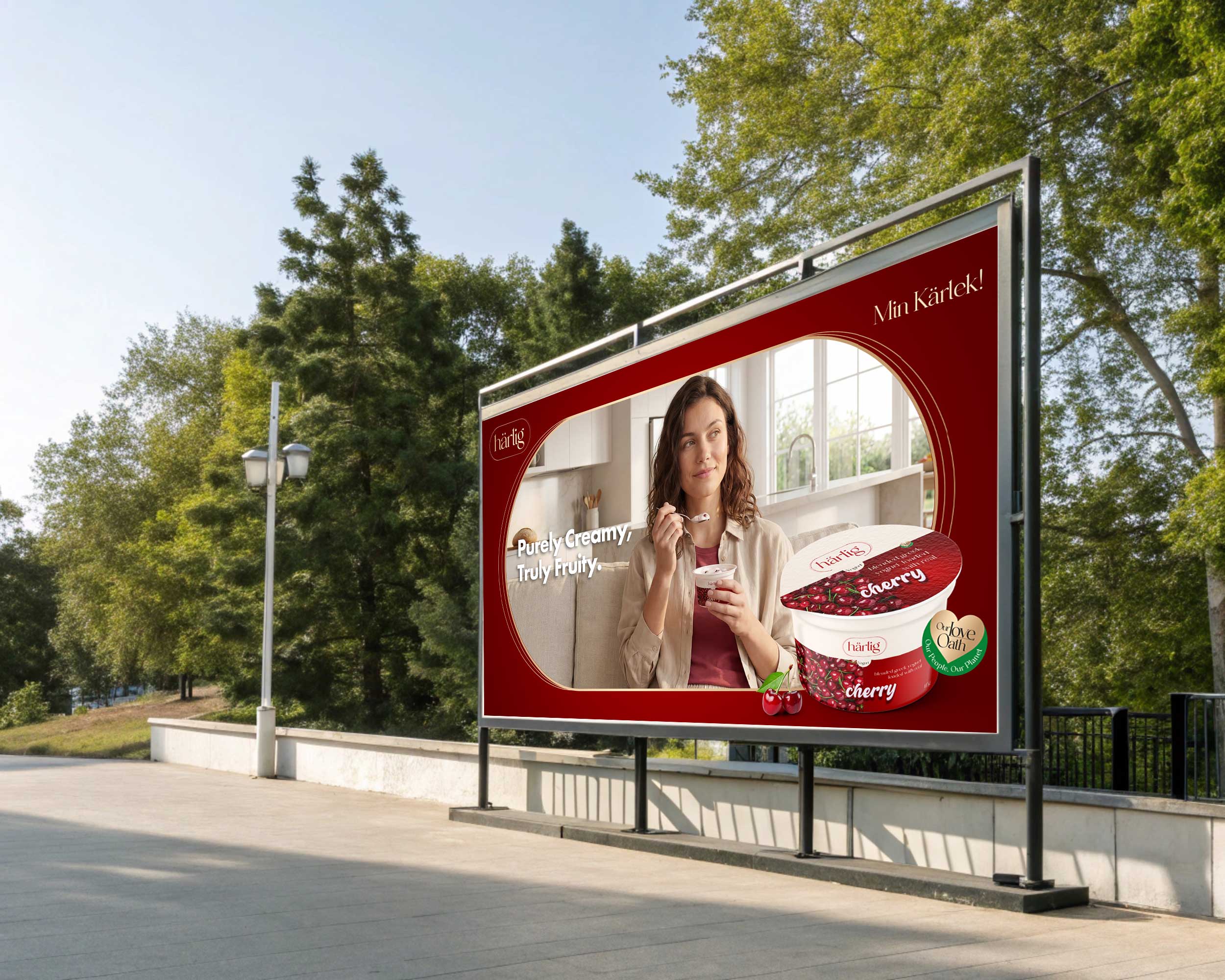
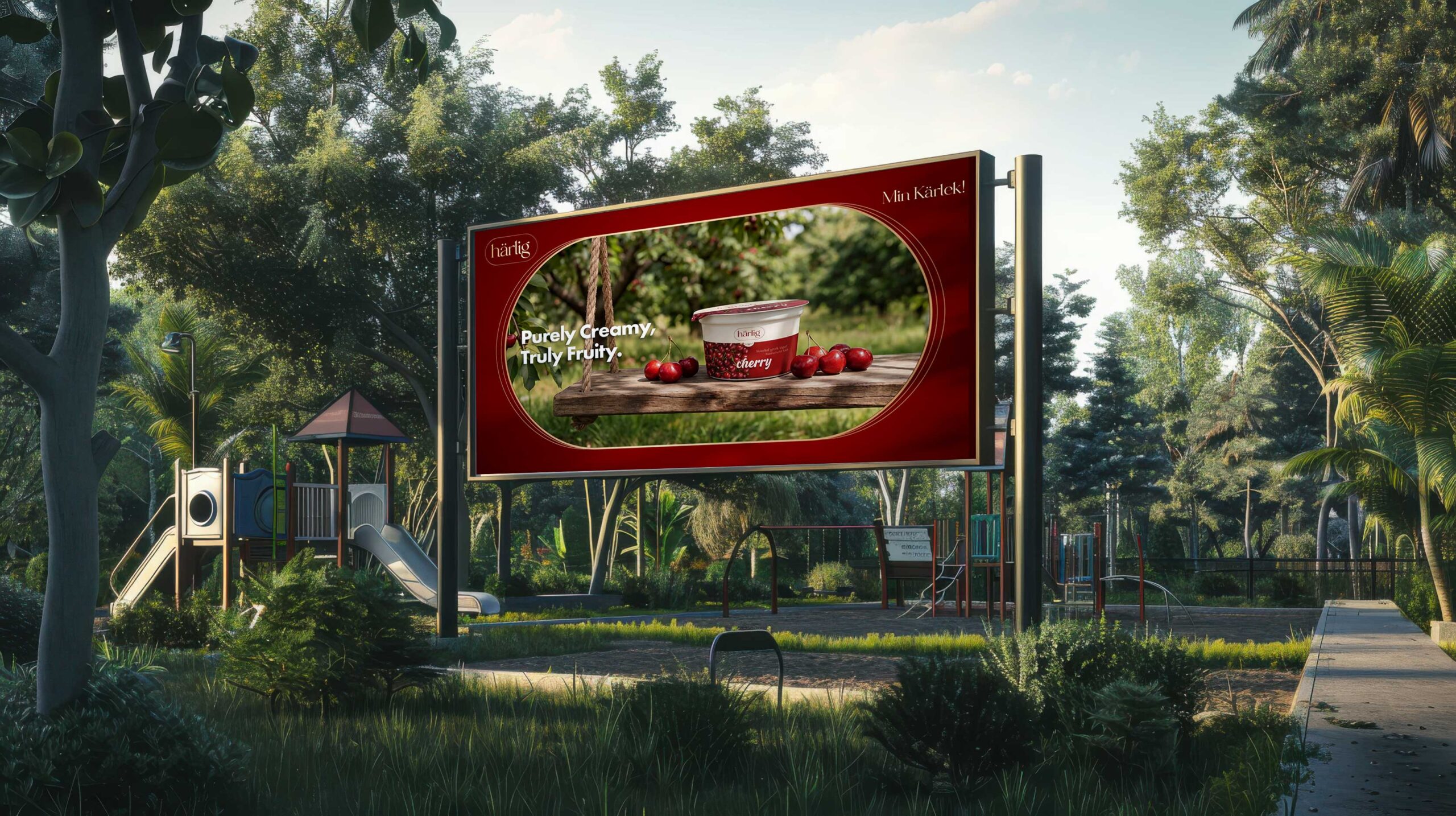
Cherry Variant
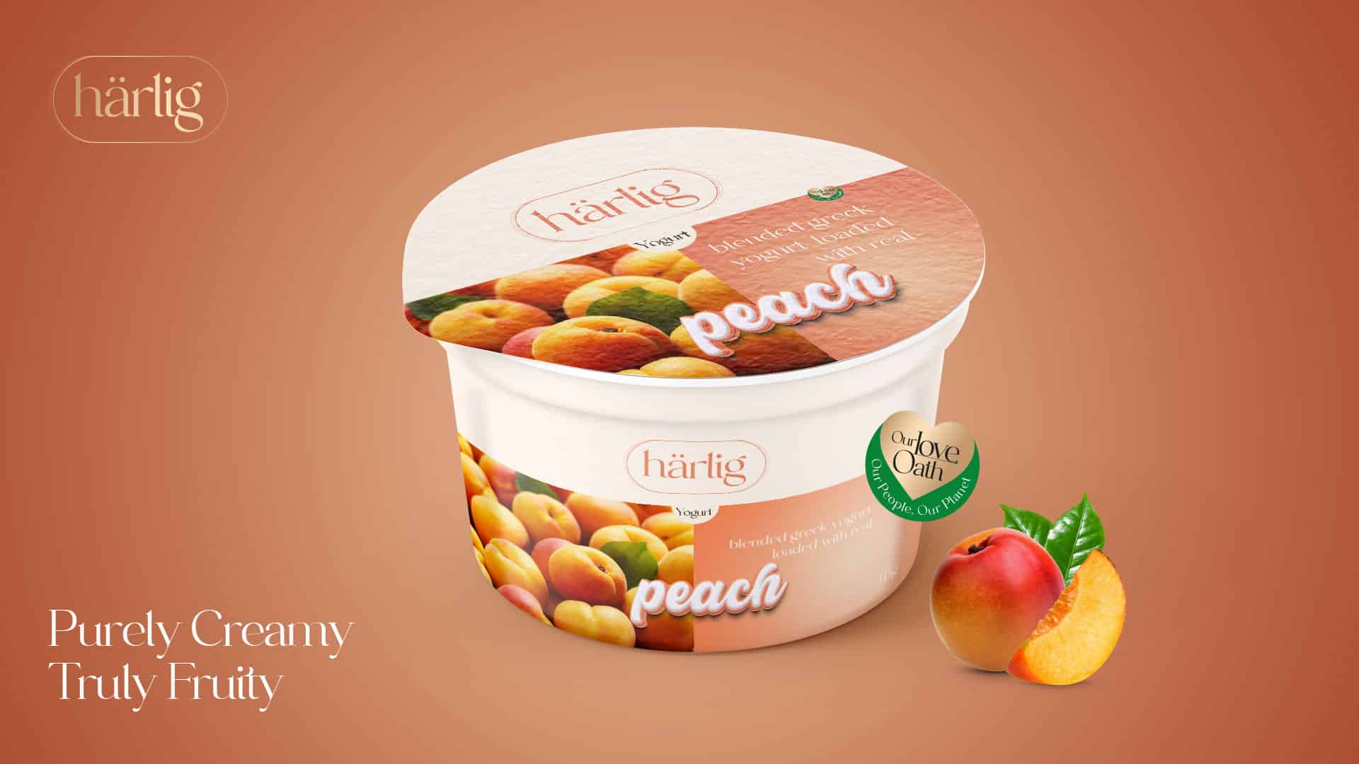
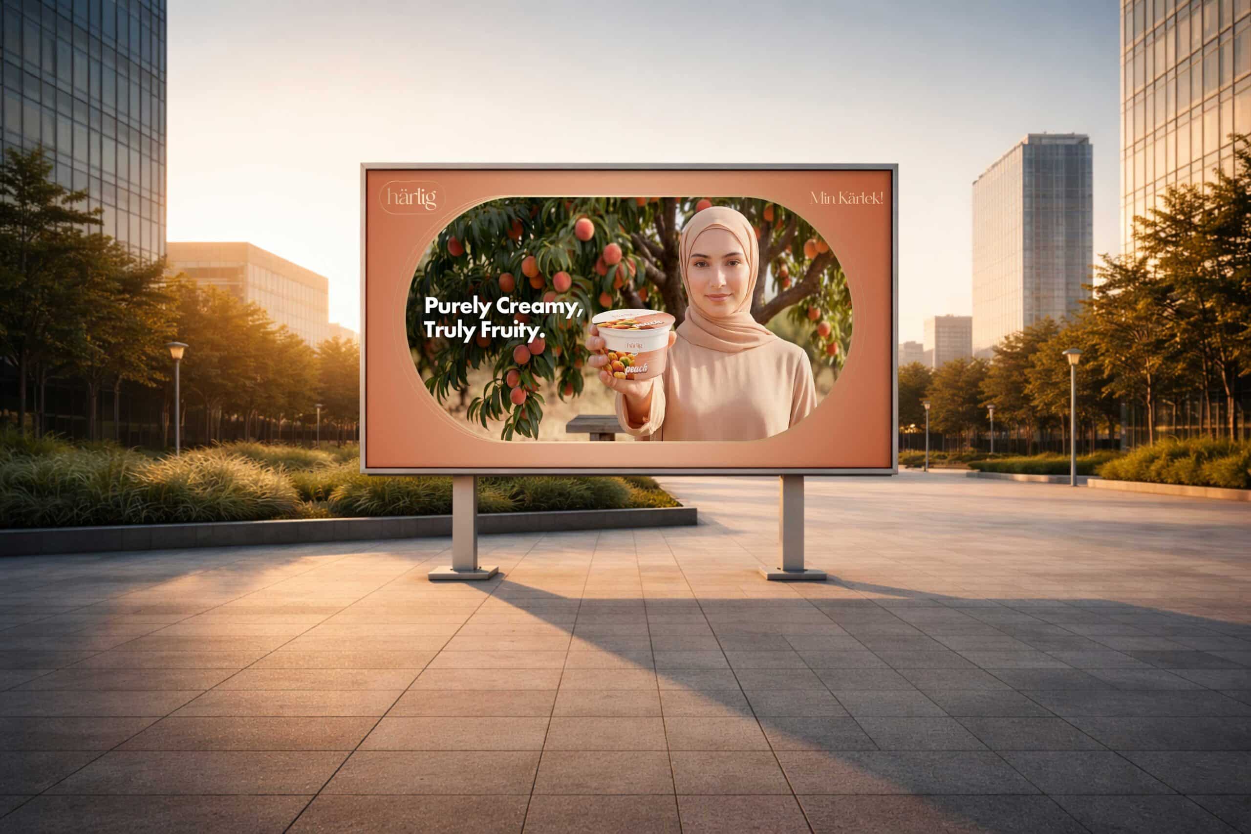
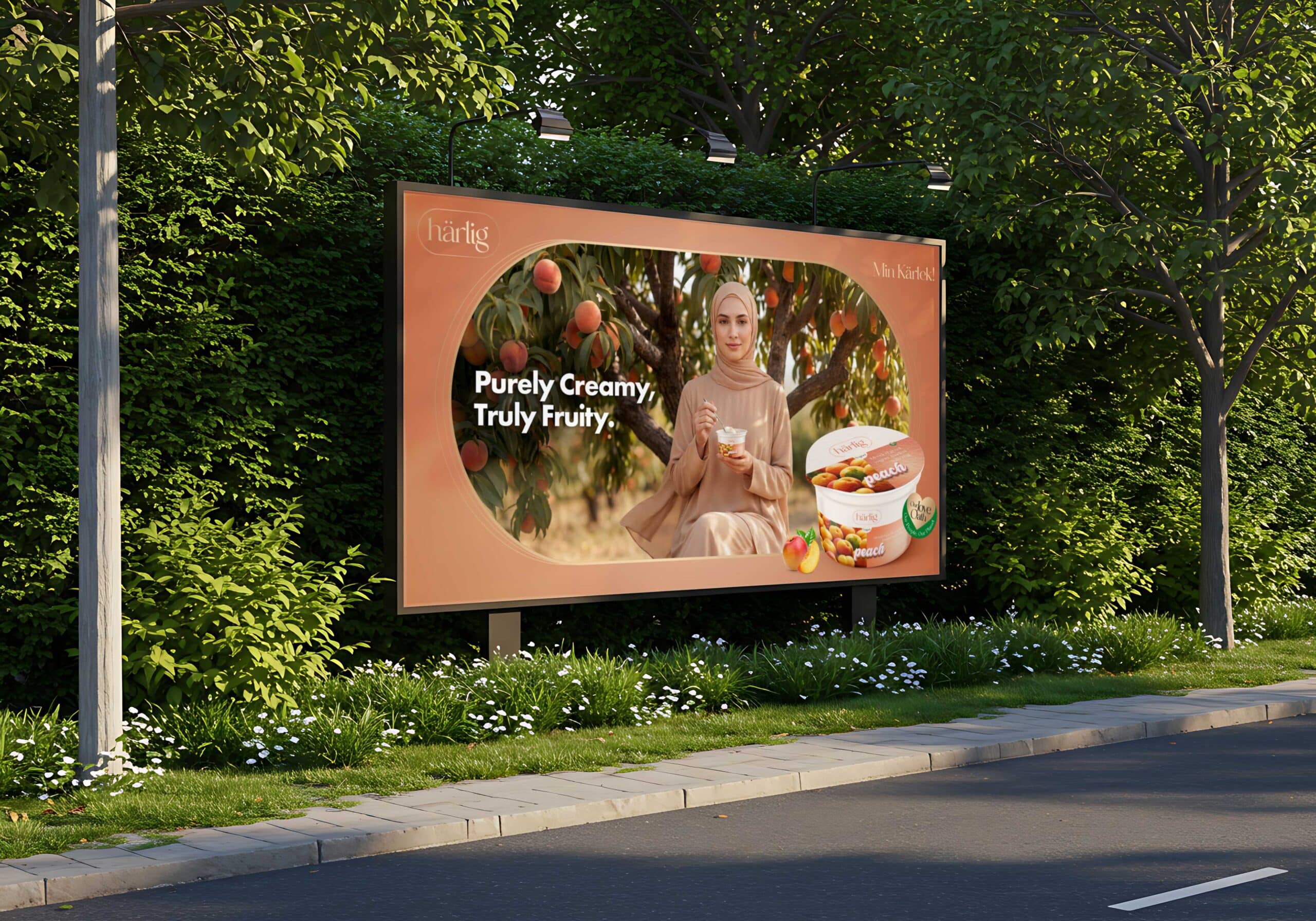
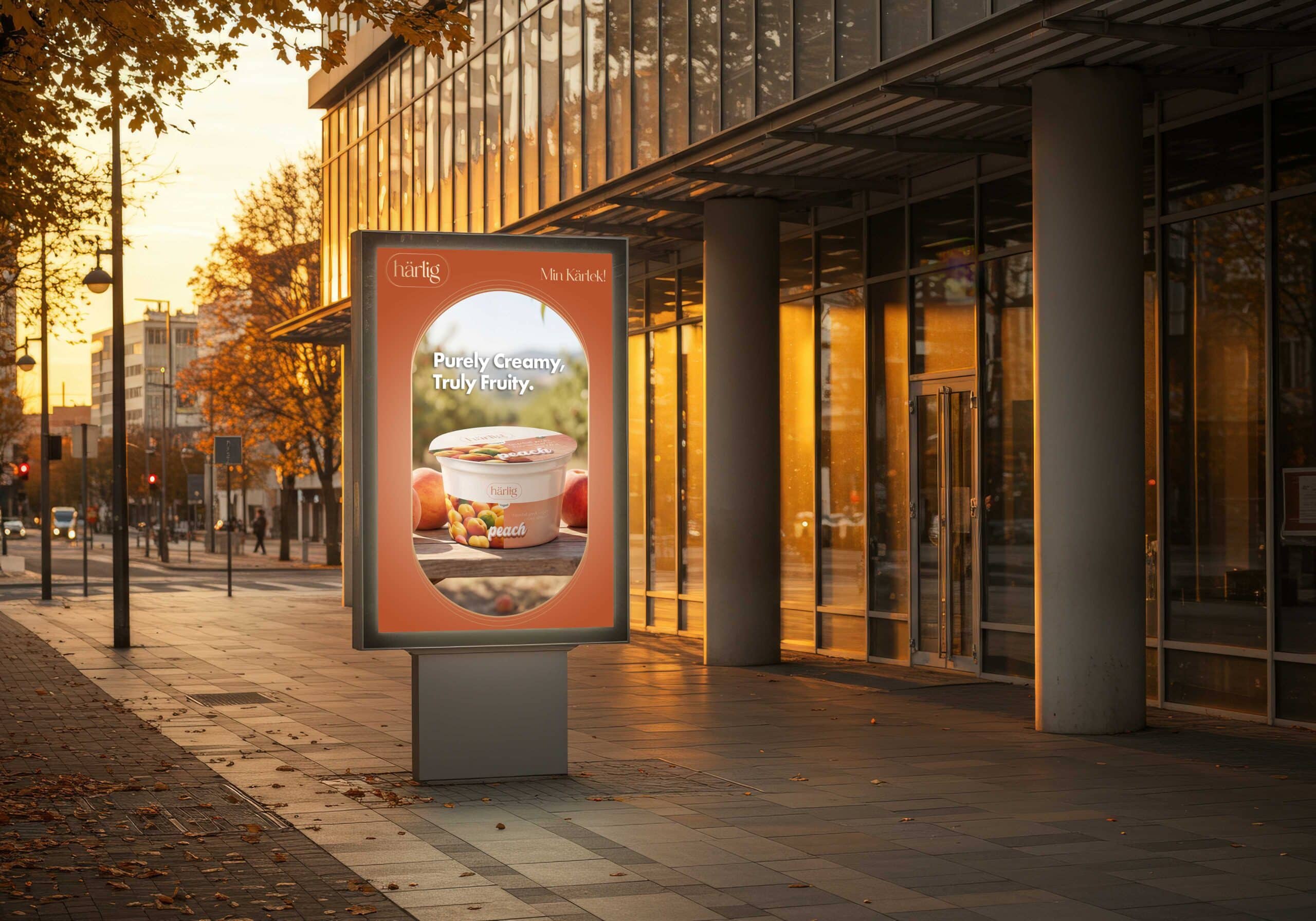
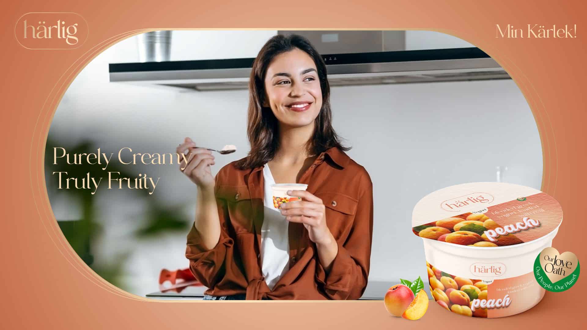
Peach Variant
A warm peach orchard bathed in golden light creates an atmosphere of calm, softness and ease. Muted tones and stillness evoke comfort and quiet nourishment.
Across both, natural textures, flowing air and light-filled environments reflect the purity of ingredients and the simplicity of a wholesome lifestyle.
Brand Message
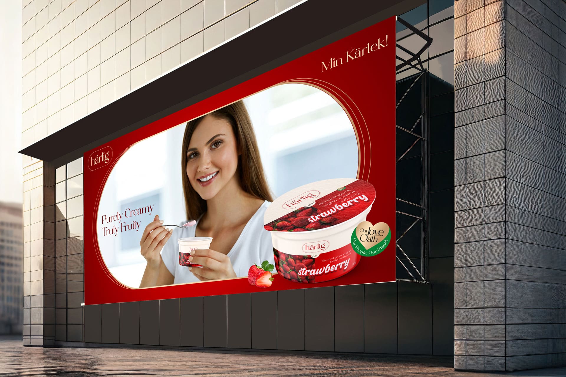
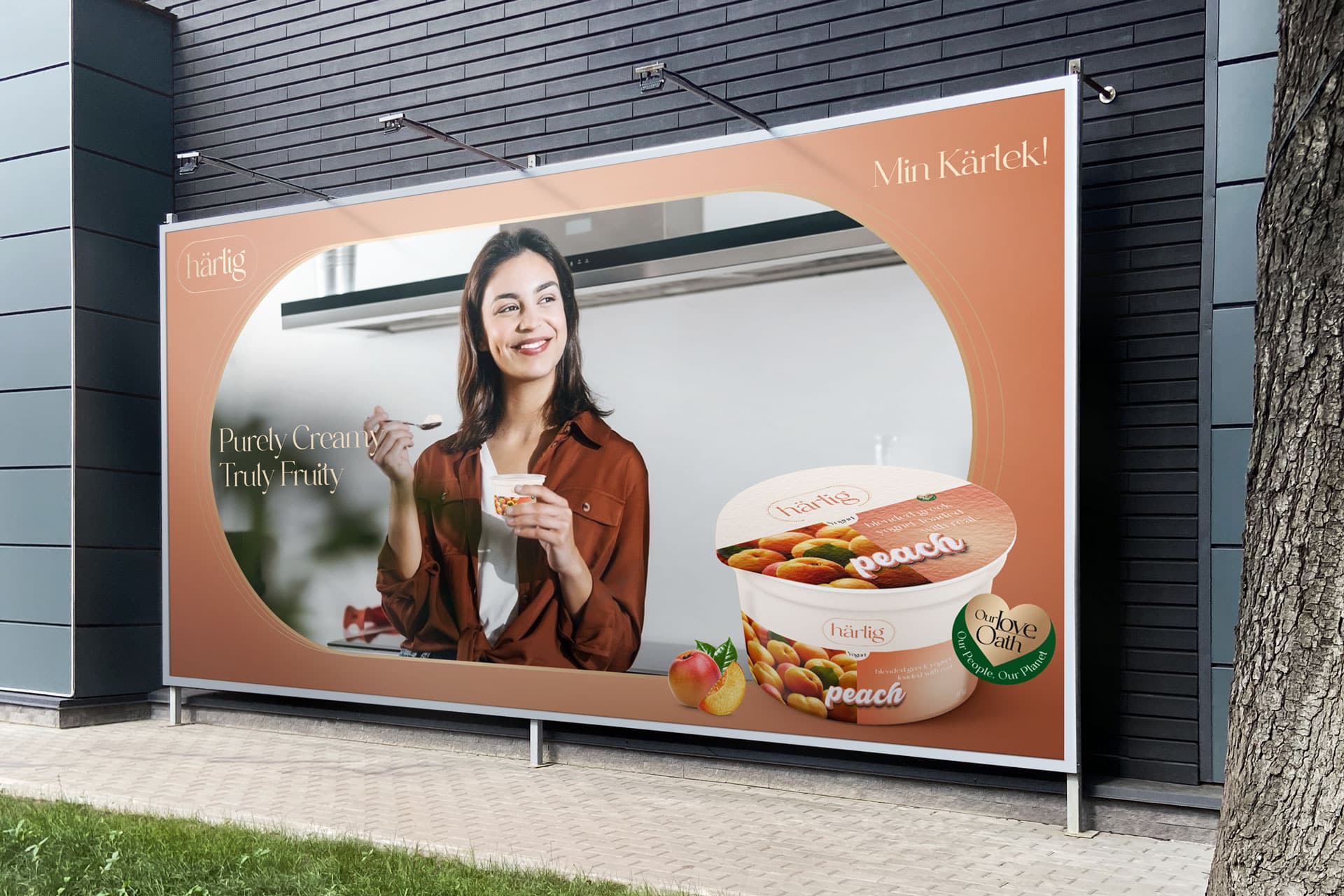
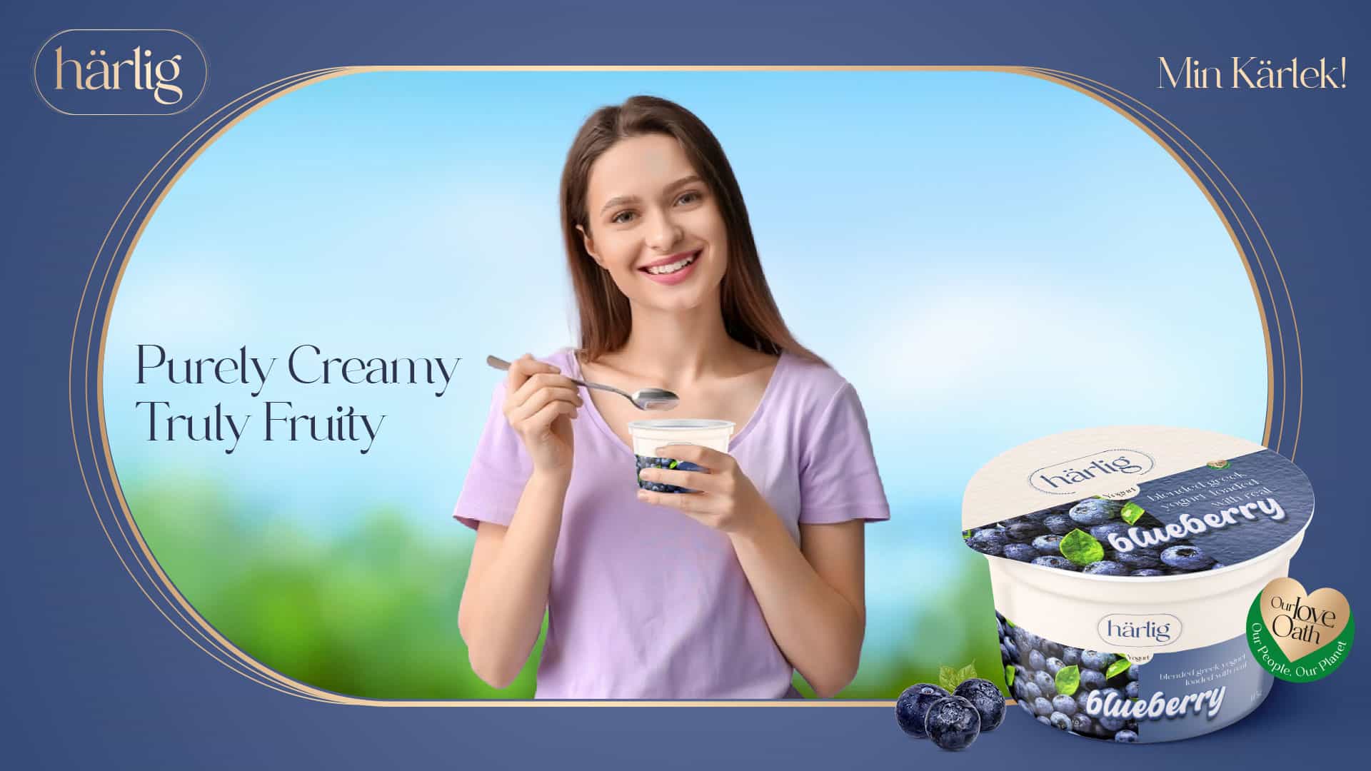
Purely Creamy. Truly Fruity.
Deliverables
- Brand Films
- Campaign Key Visuals
- Digital and Social Media Assets
- Product-Centric Visual
- Adaptations
Brand Philosophy
Brand Naming
The name “Härlig” resonates with purity and indulgence. With the introduction of Blended Greek Yogurt, Härlig continues its tradition of offering products that are a perfect blend of taste and quality.
Brand Identity Development
Design Philosophy
Visual Storytelling Design Elements
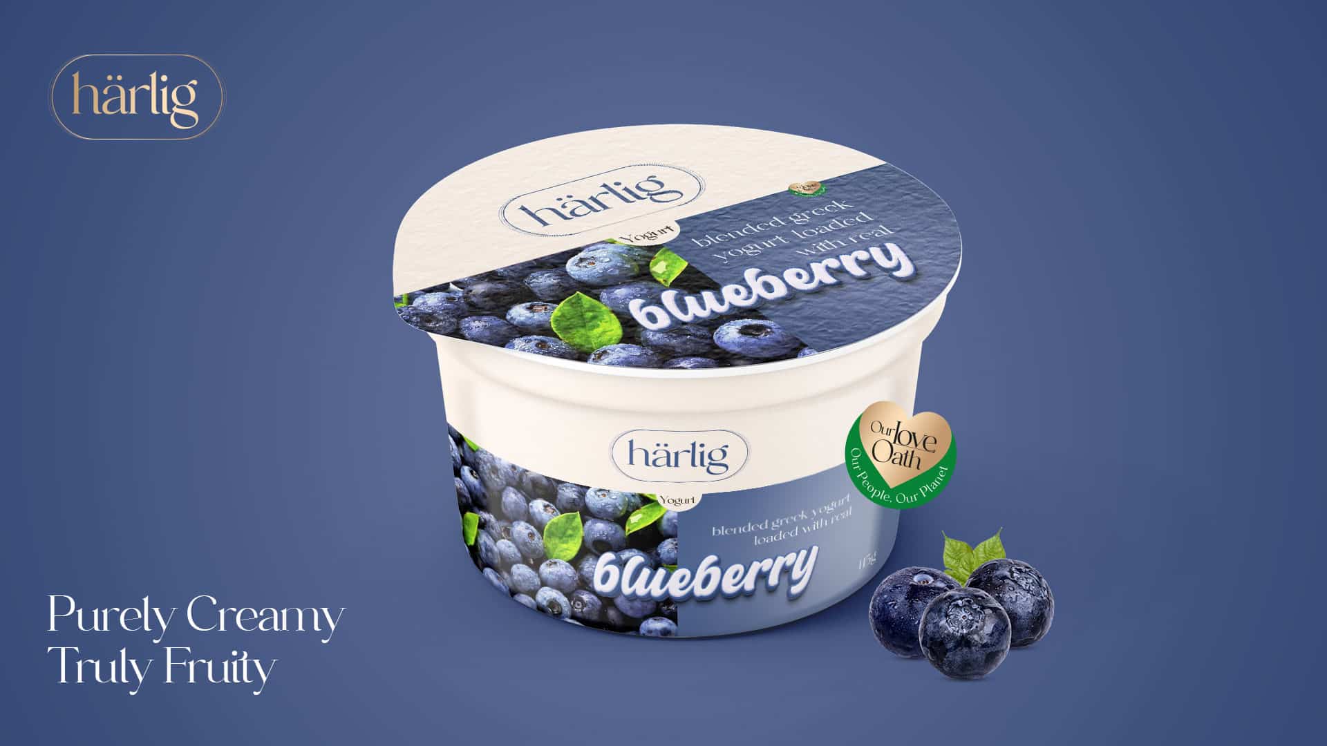
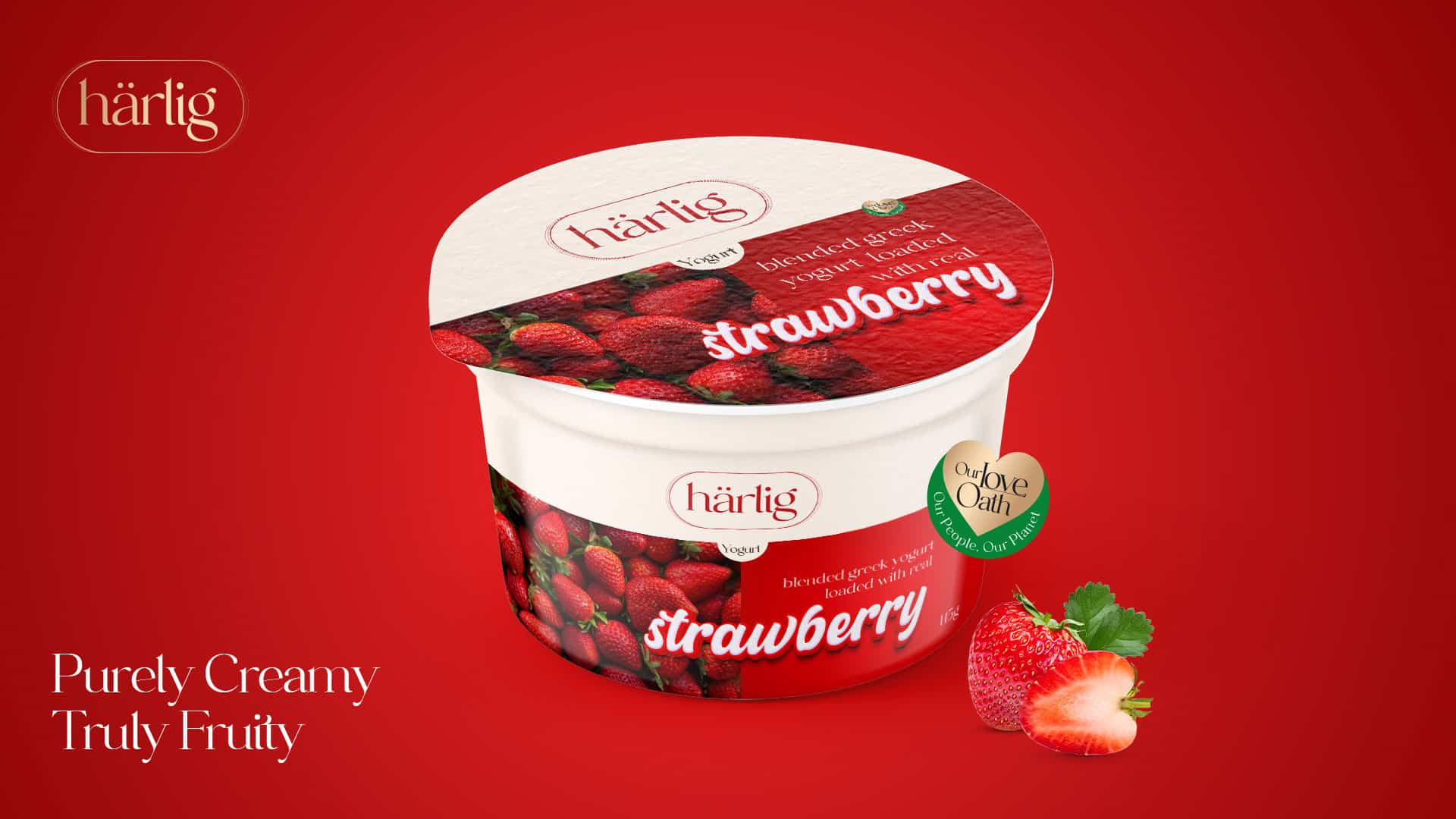
Top White Panel Strip
- This refined strip runs gracefully across the top of the packaging.
- It serves as a pristine backdrop for the “Härlig” logo, radiating sophistication.
- The color of the “Härlig” logo dynamically changes to mirror the flavor’s color code, creating a harmonious visual connection.
- The clean, uncluttered space is a nod to Härlig’s minimalist design philosophy.
Flavor Color Representation
- The bottom section of the packaging is thoughtfully bifurcated.
- One half showcases a solid color, indicative of the yogurt’s flavor, ensuring intuitive flavor recognition.
- The other half visually displays the luscious fresh fruits, such as bunches of strawberries, peaches, blueberries, cherries, etc., emphasizing the product’s freshness and authenticity.
Stylized Font
- The flavor descriptor is elegantly presented in a contemporary lowercase font.
- Positioned centrally on the packaging, this typography is accentuated in a pristine white color with a bold outline matching the flavor’s color. This design choice not only enhances visibility but also aligns with Härlig’s modern brand image.
Product Descriptor
- The phrases “Blended Greek Yogurt” and “Loaded With Real” are strategically placed atop each flavor name on the solid color block.
- This bold placement, combined with the visual of the fresh fruits, serves as a clear and enticing indicator of the genuine fruit content within.
Brand Sustainability Approach: Harlig's Love Oath
Pure Loved Base: Dive into the pristine foundation of Grade A milk and cream that sets Härlig yogurt apart as a testament to love and quality.
Nature’s Love Palette: Our commitment to nature is unwavering. We source the finest fruits, ensuring that our Greek yogurt’s real taste and nutritional values are preserved. This dedication to authenticity guarantees a genuine burst of nature in every spoonful.
Brand Essence
Brand Imagery
Brand Tagline
Web Design & E-commerce
Brand Communications
Products / Yogurt / Flavour Milk
Key Visuals





Outdoor
Website
