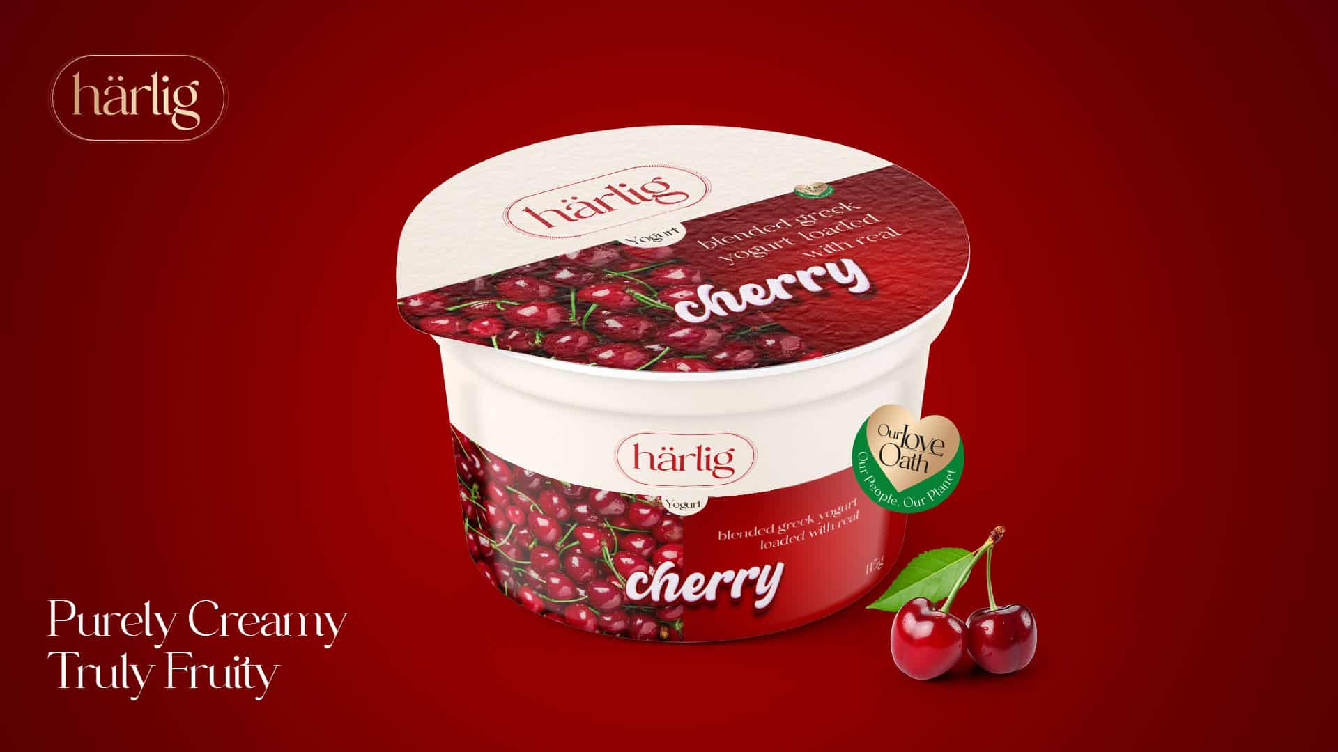
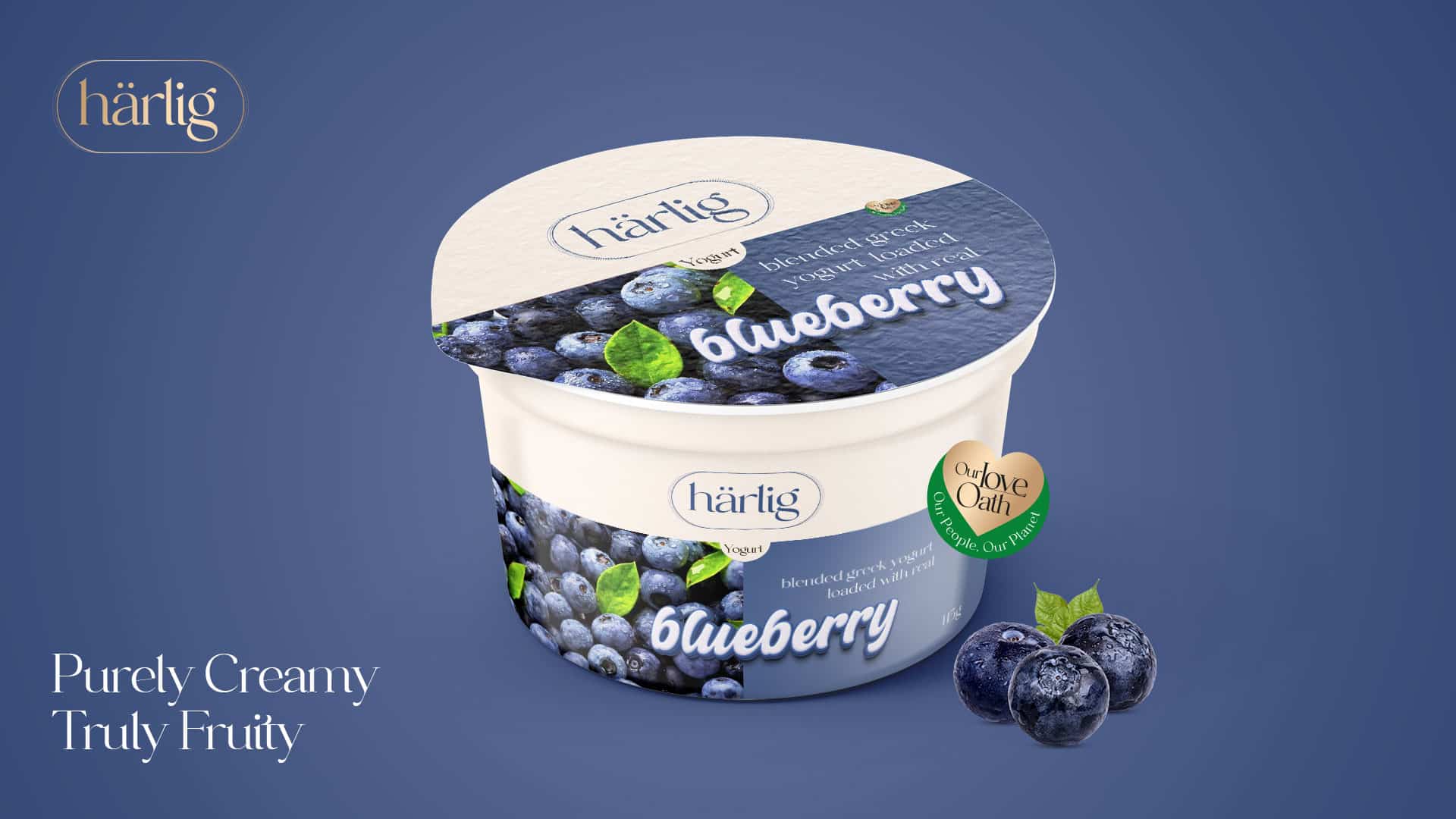
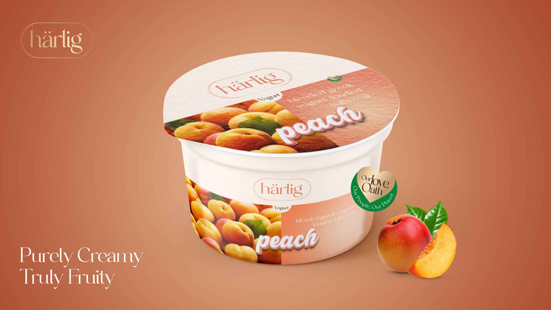
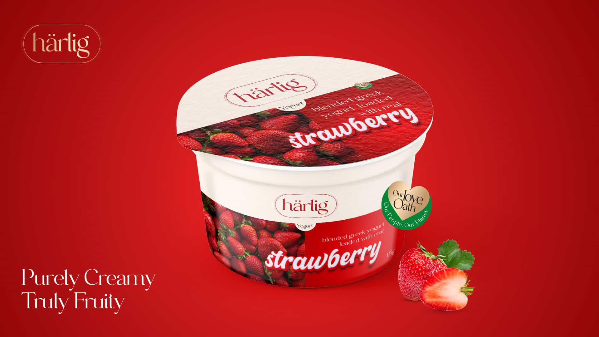
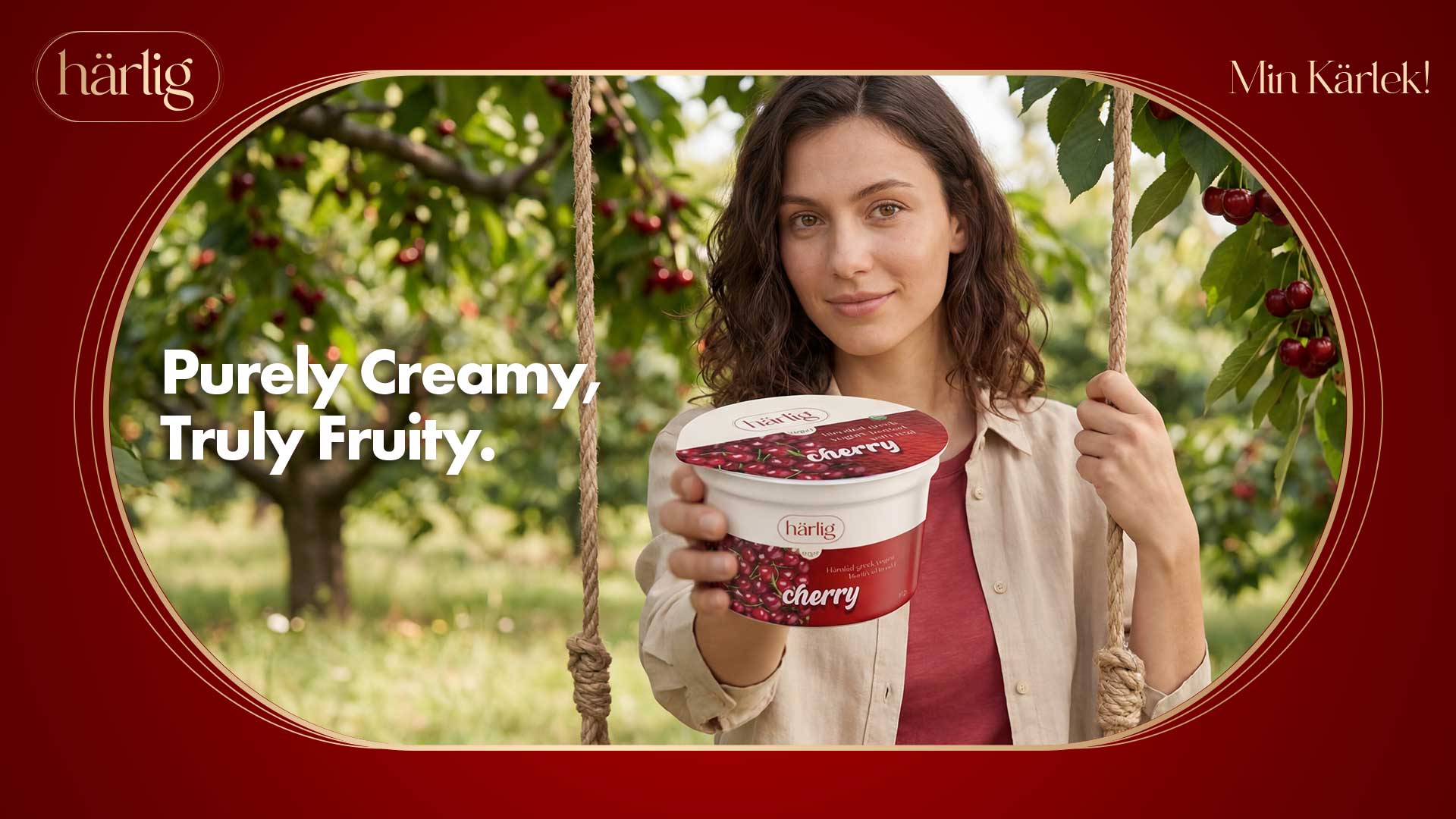
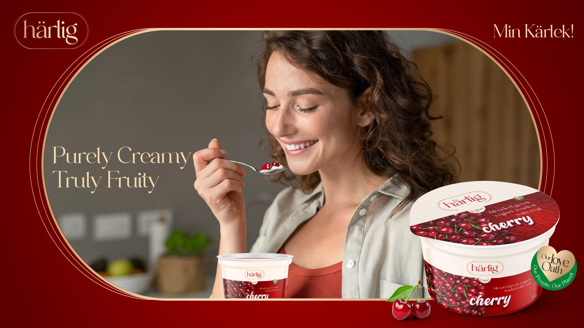
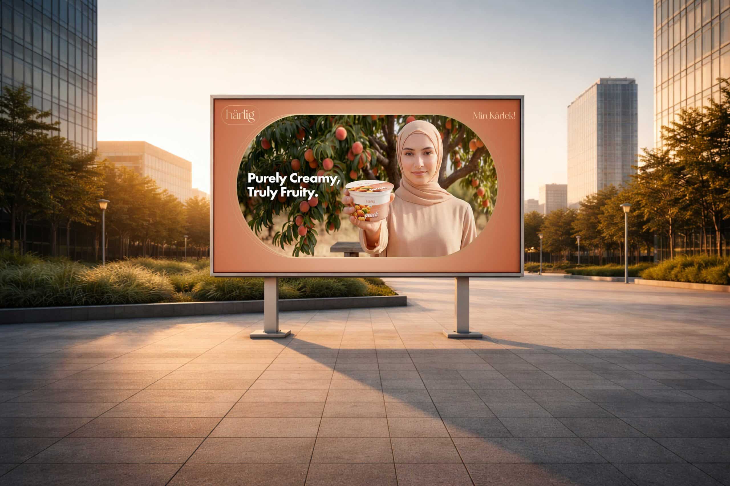
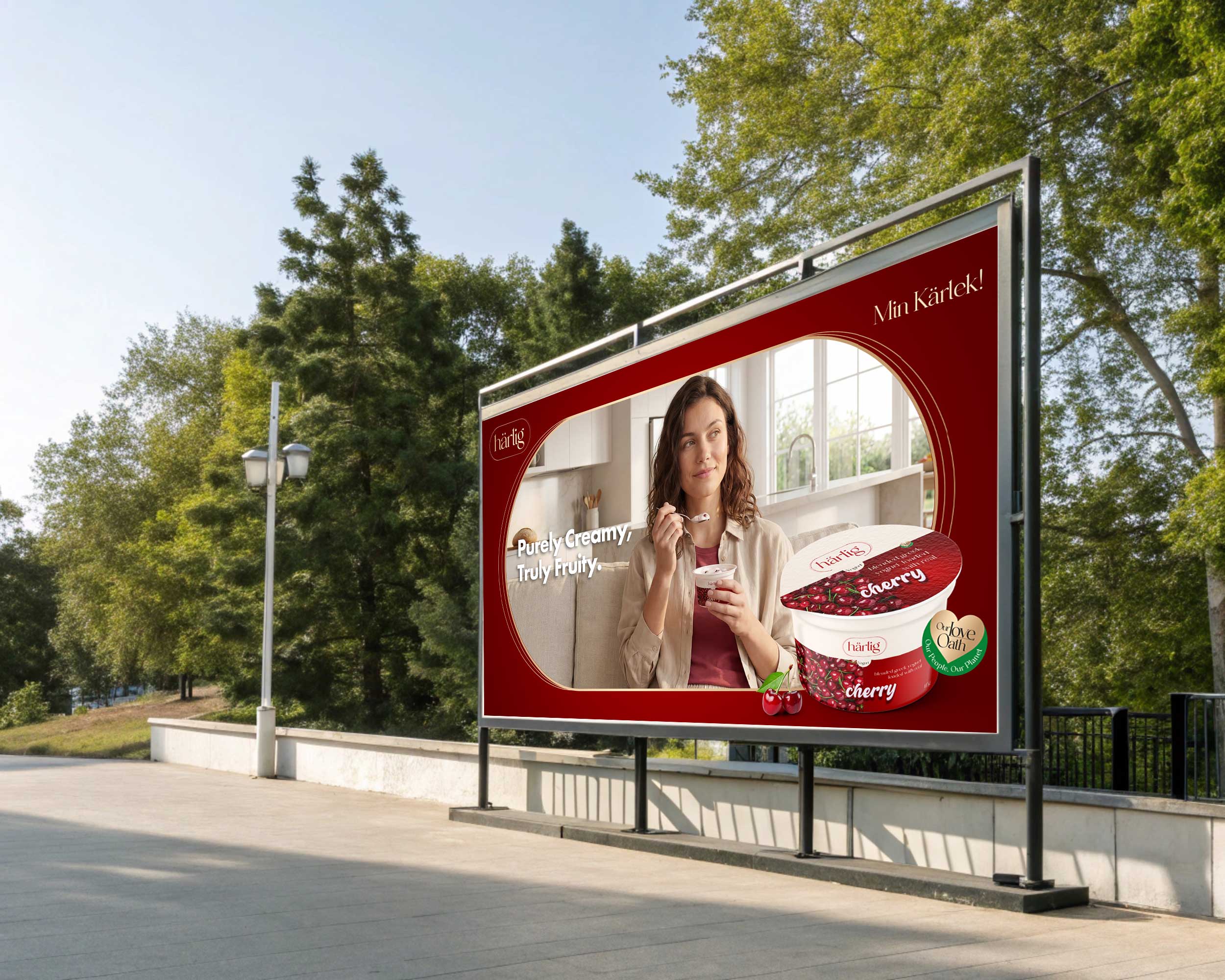
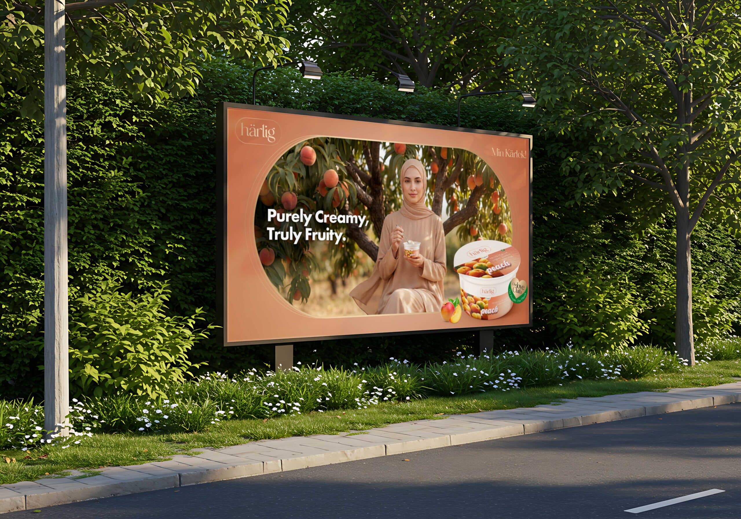
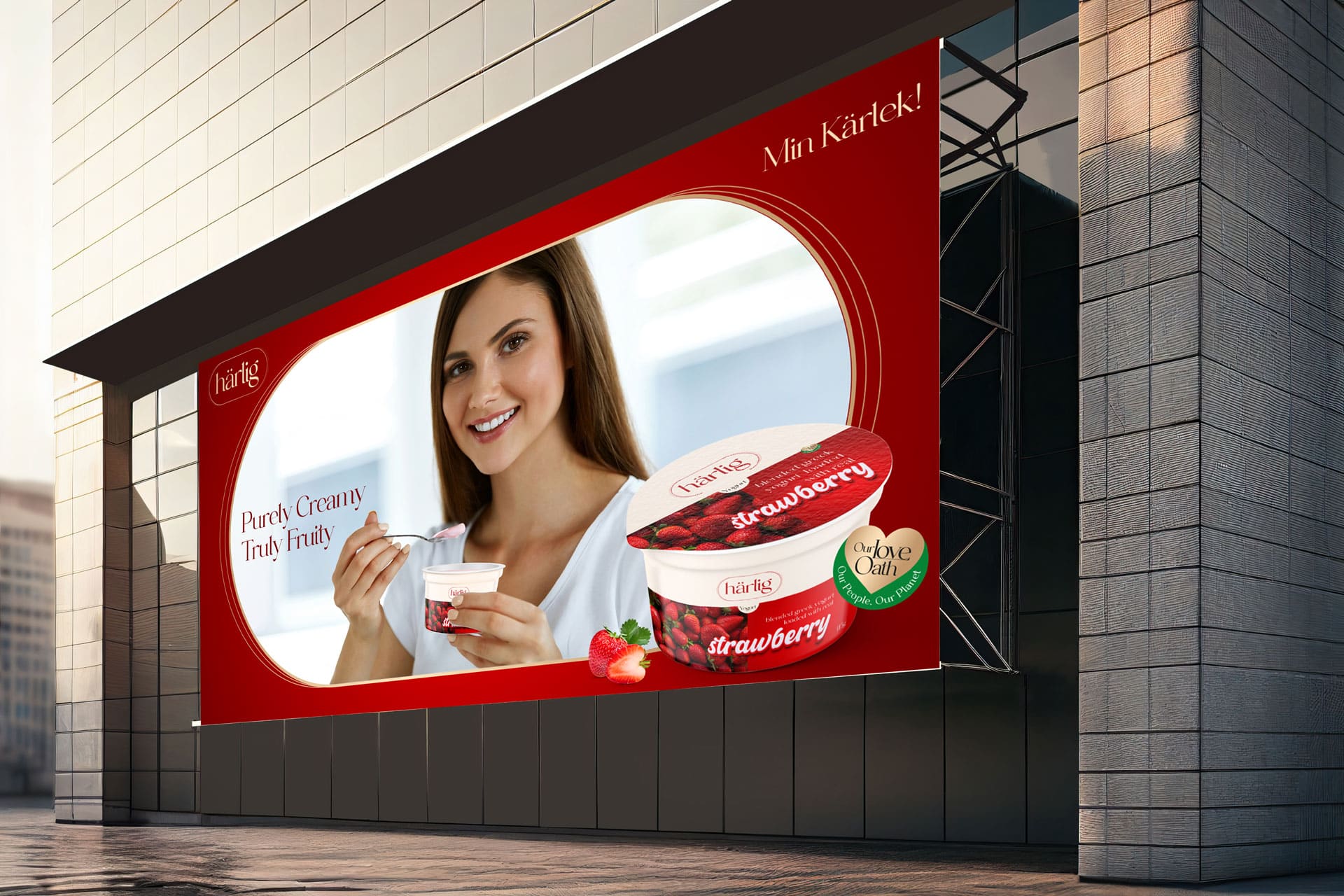
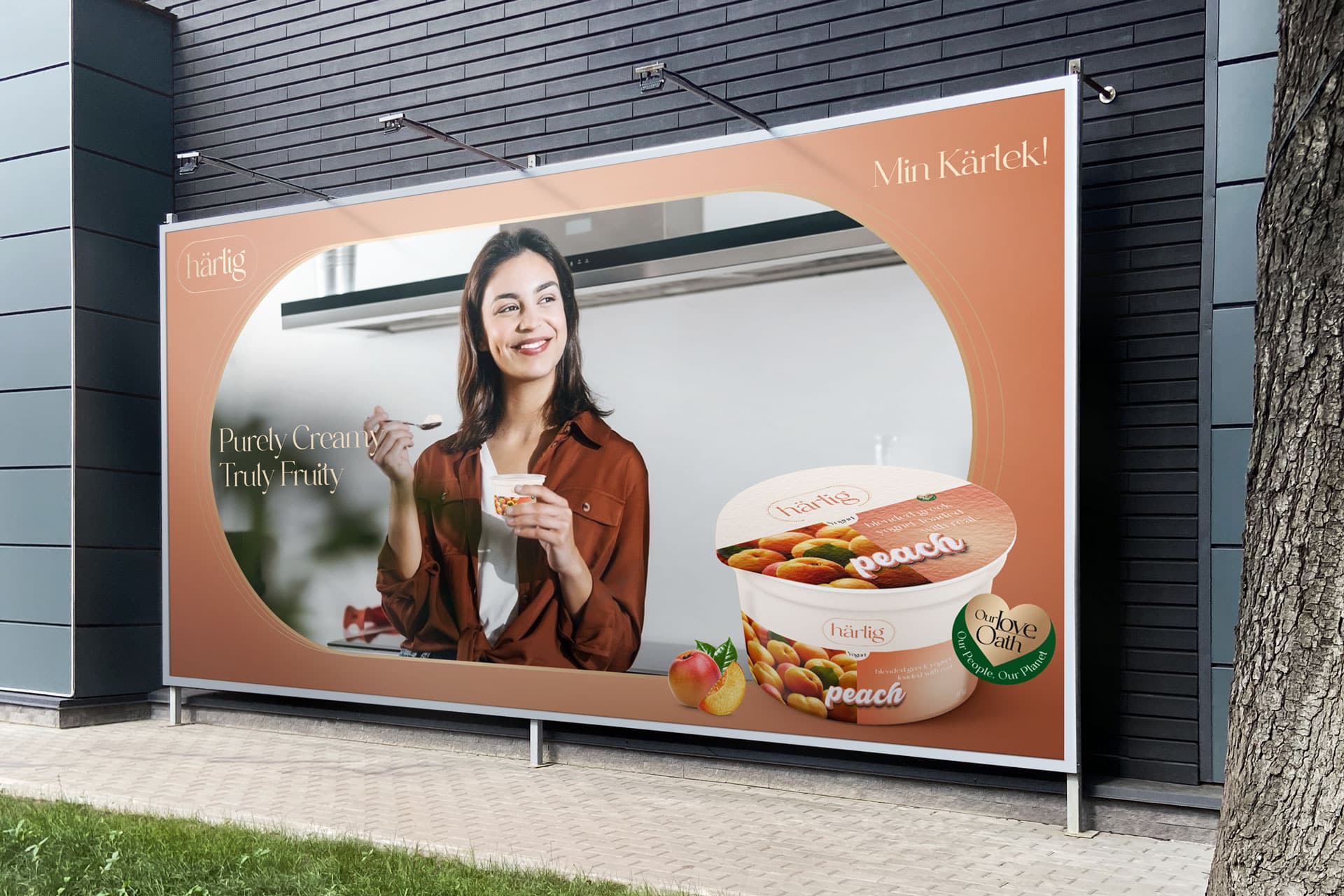
Nature's Symphony: Crafting Creamy & Fruity Greek Yogurt
Project Scope
- Brand Purpose
- Brand Strategy & Positioning
- Brand Portfolio & Architecture
- Brand Identity & Imagery
- Brand Style Guidelines
- Logo Creation
- Packaging & Label
- Messaging & Tone-of-Voice
- Brand Concepts & Communications
- Brand Tagline
- Experiential Designs
- Website & E-commerce
- Retail Branding & Merchandise
- OOH - Signage & Billboard
- Marketing Collateral
Brand Philosophy
Brand Naming
Brand Identity Development
Design Philosophy
Visual Storytelling Design Elements
Top White Panel Strip
- This refined strip runs gracefully across the top of the packaging.
- It serves as a pristine backdrop for the “Härlig” logo, radiating sophistication.
- The color of the “Härlig” logo dynamically changes to mirror the flavor’s color code, creating a harmonious visual connection.
- The clean, uncluttered space is a nod to Härlig’s minimalist design philosophy.
Flavor Color Representation
- The bottom section of the packaging is thoughtfully bifurcated.
- One half showcases a solid color, indicative of the yogurt’s flavor, ensuring intuitive flavor recognition.
- The other half visually displays the luscious fresh fruits, such as bunches of strawberries, peaches, blueberries, cherries, etc., emphasizing the product’s freshness and authenticity.
Stylized Font
- The flavor descriptor is elegantly presented in a contemporary lowercase font.
- Positioned centrally on the packaging, this typography is accentuated in a pristine white color with a bold outline matching the flavor’s color. This design choice not only enhances visibility but also aligns with Härlig’s modern brand image.
Product Descriptor
- The phrases “Blended Greek Yogurt” and “Loaded With Real” are strategically placed atop each flavor name on the solid color block.
- This bold placement, combined with the visual of the fresh fruits, serves as a clear and enticing indicator of the genuine fruit content within.
Brand Sustainability Approach: Harlig's Love Oath
Pure Loved Base: Dive into the pristine foundation of Grade A milk and cream that sets Härlig yogurt apart as a testament to love and quality.
Nature’s Love Palette: Our commitment to nature is unwavering. We source the finest fruits, ensuring that our Greek yogurt’s real taste and nutritional values are preserved. This dedication to authenticity guarantees a genuine burst of nature in every spoonful.
Brand Essence
Brand Imagery
Brand Tagline
Web Design & E-commerce
Brand Communications
Products / Yogurt / Flavour Milk
Key Visuals
Outdoor
Website

